Tuesday, 28 November 2017

Mirror, Mirror - Drawing From The Other Side

Introduction

Sometimes I like to work back from the last frame because it's often the most important one. I can then take elements I've already drawn and use them in frames that come before it.


Drawing the Reverse
The animation doesn't look quite how I wanted it, but it shows that the drawing won't work quite right without altering the silouhette a little. The heads needed to be turned in slightly or looked wrong.

I did similar for the desk (notice the angles match), then the computer monitor, and finally swapped the order of the layers to give me the new scene.

The Completed Scenes

Using this technique saves a lot of time and provides a consistent look. But, just make sure your characters are different enough from each other or you will confuse the reader. You have swapped their positions in the frame so use as many tricks as you can to differentiate them.

Link to cartoon >>> http://funstreak.webcomic.ws/comics/33

Wednesday, 1 November 2017

Posting Your Comics on Reddit (Part 2)

Introduction

In my last blog I talked about the pros and cons (mostly the cons) when using Reddit to promote your comics. But I also wanted to pass on some of my musings about the reason that one of my comics performed so well.

Let’s start off by looking at my submissions:-
Date
Comic
Score
Views
Comments
16th Oct 2017
2 (75% upvoted)
66
0
16th Oct 2017
2 (100% upvoted)
89
0
16th Oct 2017
4 (75% upvoted)
200
0
16th Oct 2017
3 (81% upvoted)
125
0
16th Oct 2017
2 (63% upvoted)
74
0
17th Oct 2017
3 (100% upvoted)
210
0
18th Oct 2017
167 (90% upvoted)
3400
2
19th Oct 2017
98 (81% upvoted)
2700
4
20th Oct 2017
20 (75% upvoted)
301
0
22nd Oct 2017
6113 (85% upvoted)
57.2k
290

What does this tell me?
  • If you look at the score, it shows that you nearly always get down-votes. The percentages look small, but when you start looking at Sauce of Genius, that’s a thousand people expressing their dislike. It reduced my score by a thousand, which impacts how easily it goes into (and stays on) the ‘hot’ page.
  • Comments tend to track Score, it’s not until you get a cartoon on the ‘Rising’ or ‘Hot’ page that you attract the attention of those that feel the need to tell you something.

So, why did “Sauce of Genius” do so well?

The Sauce of Genius

That’s a great question, because I didn’t think it was better than say “The Gas is Greener”. It’s not a bad comic idea, it's drawn quite well and has the following attributes:-
  • It’s relatable, everyone likes sauce.
This generated most of the positive comments, people talking about their favourites and what foods it's good for. Some even talked about alternatives they didn't like.

  • I had altered the label of HP Sauce to read “Brown”. 
Loads of people needed to tell me it was actually called HP, completely missing the point of the joke. In the UK it's all known as brown sauce, I just chose that one because it was so recognisable. This also generates conversations about the UK and how HP was no longer available in the USA.

  • Some of the statements are not true.
OK, here's where people started to really take issues. I took a lot of flak for Buffalo really being named after the place, and even my statement about Tabasco (which was true) was generally rubbished. Way to ruin a joke guys!!
Some asked if my intention was to be as inaccurate as possible, while others were amused that so many were getting hung-up on these details. (It certainly made me laugh)
Others started to get creative and came up with their own fake-sauce-facts. (very funny)
But generally I'm a bad person for doing zero research!

  • One of the pictures appears to portray Thousand Island as a tropical island.
This one probably caused the most friction. Yes, it’s really up by New York, but I never said it wasn't. People seemed to be genuinely insulted by this one. It also generated a lot of discussion about New York and what Thousand Islands is really like.

Lessons Learnt

Although unintended, this comic was a little controversial. At first I was a bit embarrassed that people were finding obvious holes, but it soon started to feel like a joke on the readers when so many were taking it so seriously. It's one way to generate interest, but I imagine it could easily backfire if enough people down-vote it as soon as you post it. You also need thick skin and should resist the temptation to defend yourself.

That aside, I think mainly people could easily relate to it and understood the joke.

Something I'm still uncertain of is whether post images directly into Reddit is better than linking to a comic site.

Thursday, 26 October 2017

Mixed Blessings - Promoting Your Comics on Reddit

Moving to A Bigger Audience

Trying to grow your comic audience is a big challenge to most cartoonists, you can create the greatest material in the world, but if nobody sees it then you might as well not bother. Most artists find one or two comic hosting sites to post to, and find they can easily get some followers and readers from amongst their peers. But you always want more, which generally means promoting your work elsewhere.

I’ve experimented with a few such as Ello and Tumblr, but by far the biggest impact I’ve had so far is with Reddit. The first day I posted five old comics and pushed my site page hits to just short of a thousand, but it’s not without its problems.

Posting Cartoons To Reddit

My teenage son was surprised when I told him I’d started posting cartoons to Reddit, like he knew something that I didn’t. I could tell something wasn’t quite right because of all the Reddit user advisory notes down the right hand panel on the /r/comics sub-reddit page.


There's stuff about General Conduct, What's OK to Post, What's NOT OK to Post, and some tips for artists. There's similar in most of the other sub-reddits, so you get the impression there's been abuse of the system in the past.

The Bad

It's best to think of /r/comics like a toxic tank full of piranhas, but if you decide to risk it you can get incredible levels of page views. In my experience they’ll either swarm all over you or ignore you completely. (mostly the latter) This week however, I did have a cartoon that went surprisingly well. It was a bitter-sweet moment, and probably something I'll cover in another blog.

Let's just say I learnt a few things.

Comments

Let's for a moment consider reader's comments on Reddit,...
  • Don’t feed the trolls, try to take a back seat and don't get drawn in.
  • Some may be pedantic or picky about certain details in your work.
  • Some have a Asperger's level compulsion to correct anything they consider incorrect.
  • Any sort of self promotion, including posting a link to your site may be voted down, possibly with a few snotty comments.

Down Voting

If you've not seen Reddit before, you should be aware that user posts are up or down voted by the readers. Up-voting makes your cartoon more visible and down-voting has the opposite effect. So you may find that a perfectly good cartoon (one that’s been received OK elsewhere) immediately gets a few "down-votes" and ultimately bombs. This can be highly frustrating and may be an indication that your cartoon isn’t so well suited to this audience.

It’s well worth taking a look at the more successful cartoons, the crowd is “laddish” or in the US you’d call them “Bros”, so you might want to consider whether your cartoon is suitable.

Coping With The Swarm

Getting onto the ‘Hot’ page is not a simple matter and in my experience it involved a fair bit of luck. I found it helpful to consider every new submission to be an experiment and not get too attached to the process or the outcome. Your work is likely to fail here, but that doesn't mean it’s a bad comic. (keep that in mind at all times!)

Use the "[OC]" tag in the title and request “Artistic Flair” from the moderator. This generally involves putting a link back to your Reddit user page from your cartoon site (you can always remove it again afterwards). This highlights your posts with the name of your comic, but don’t expect this to grant you better treatment.

Most people don’t want to leave a comment, it’s just a fact of life, but some will be compelled to type these sorts of things:-
  • Witty comments (some are quite funny).
  • Corrections to your work that they feel would improve it.
  • How your work relates to them directly.
  • Reactions to other people’s idiot comments.
  • Thoughtful side discussion topics.
  • General scorn.
(It's a real mixed bag with a fair amount of negative stuff there.)

My son advised me to never reply or react to any comments. This seems very alien when elsewhere it’s encouraged, but based on my own interactions on Reddit I’m inclined to agree with him. Some comments may question you directly, but it’s best to sit back and see if somebody will answer on your behalf.

Here’s one of the comments I received when I tried to defend my posting of the comic site url..

OnlySaysHaas “You make some whiney-arse comment in every one of your comic submissions about people not having a sense of humour, or being downvoted. Grow up and take your criticism.“

Okay, you can block users who give you a hard time, but it’s best to stay out of it and let the chimps play.

(Go to part 2)

Monday, 9 October 2017

Webcomics - This isn't Catch-Phrase

Say What You See

My rampant abuse of idioms continued this week with the saying "Cooking The Books", and while it would be obvious to draw a book (or two) boiling away in a big cooking pot, it was starting to feel like I was just churning out ideas that would be better suited to the old TV show 'Catchphrase'

Catchphrase - yes they normally are this simple!!


Those not familiar with the show should know it was all about recognising well known sayings and titles based on cartoon-like drawings. I used to watch this show a lot, probably because I was quite good at it.

The original host was Roy Walker and he would say stuff like..

QuoteWhat he meant
Say what you see.You're on TV, just take a guess would ya!
It's good, but it's not right.No, that's not even close!
Keep pressing and guessing.We get the funniest answers when you guess.
Riiigghhhttt.Thank god for that, it was like drawing teeth that one!

**BUT**, this isn't what I want out of FunStreak.

Puntastic, Another List

Yes, I know,.. it's another list (laffs nervously), I guess that's just the way my brain works. I come up with ONE funny pun and then the challenge is on to see how many others I can find to join it. This time I decided to use them in a menu, then it's almost superfluous, but at that stage I still had no idea what my punchline was going to be.

This sounds a lot like the Micawber Principle, which is named after the character from the book David Copperfield who, whilst struggling at near poverty, hangs onto the notion that, "something will turn up". Many comedians build their humour backwards, working retrospectively from the punchline and then adding things they need to set up the joke. It doesn't feel like a very spontaneous way of doing it, but it does work quite well. I find my ideas come frontways, backwards, sideways, all sorts of methods,... no particular pattern or method is ignored. (so I'm not sure what that says about me!!)

I resorted to listing as many types of book I could think of, many of which I couldn't think up puns for. I also decided to steer clear of religious books, such as my personal favourite, "Quran t'bun", because some people waste their lives looking for insults. Hopefully those I did include made up for this serious omission.

Say what you see!!

Tuesday, 3 October 2017

Monday, 2 October 2017

MAD?.. No, But it Helps!

Introducing Alfred

Last year Alfred E Neuman, the MAD magazine mascot turned 60, having been featured on the cover of almost every magazine since 1956. Originally created by Norman Mingo to be a "What me, worry?" face, copied from postcards and adverts popular in the first part of that century. It has since become a famous image, even for those unfamiliar with the magazine. But due to the picture's origins, a court in 1965 found the image to be effectively in the public domain.

So my worries about basing my work on him where unfounded.

Back to the Idioms

The next item on my list was the phrase "better to give that receive". A phrase often used at Christmas to signify to children the importance of giving. What better than to draw something that most kids wouldn't want to receive.

My black-eyed kid based on MAD's mascot.
He's quite a lop-sided little fella isn't he?!

I started out with a rough copy of Alfred, but after I'd blacked his eye out it didn't seem right to keep that cheeky smile. So I changed the mouth and dropped the left eyebrow. This gives quite a non-destinct look, completely changing the character of the drawing.

The comic can be found at: http://funstreak.webcomic.ws/comics/25

Friday, 29 September 2017

Slow food

We've talked about whether you find a good joke by working through a situation and then thinking of the twist, or whether you start with the twist and work backwards.

This is the start of a story that I like. I'm convinced there's a funny and unexpected ending but I don't have it yet.

The squirrel buries a nut, Then comes back in winter but the ground is covered with snow, and our little hoarder looks puzzled. Then it's spring and there's a shoot coming out of the ground. Yvonne has observed all this.

The best end I have so far is that the squirrel comes back and trips over the seedling.

Maybe Yvonne munches the seedling with a comment about slow food, or helluva way to crack a nut. Or something.

[update] this is my favourite ending so far. Yvonne tells him she knew where it was, he only had to ask for help. He says he was fine, as his stomach rumbles.

(silhouette, sunset behind them)

Idioms - Keeping it Simple

Intro

Months and months ago, when I first started using FunStreak for experimenting with ideas, I trawled the web for as many usable idioms and well known sayings as I could find.

I was looking at this list the other day and had been mulling over how to do the next cartoon. I'd chosen "Fighting Fire With Fire" and had always considered it should feature a fireman, maybe on some sort of fireman inititive day failure.

With this in mind I decided to look up similar idioms and maybe have a list:-
  • Adding fuel to the fire
  • Burn the midnight oil
  • Feel the burn
  • Keep the home fires burning
  • Like a moth to the flame
  • Baptism by fire

The list could be, "Sayings that don't help when putting out house fires"

It was OK, but I've created a few list based cartoons recently, so I shelved that idea.

Go For The Simple

In the end simple is king, I'd found a great bit of dialogue and just needed a line to explain what was going on. I could have mentioned the well known saying right then, but I chose not to. I think it's better for it.

You're Fired - Funstreak 28th Sept 2017

Link to the original cartoon: funstreak.webcomic.ws/comics/24

The gravity of the situation


Here's the plan. I know the joke I want to make (they think gravity goes upwards - grass grows upwards, there must be something pulling it in that direction).

I'm not sure whether the apple falling on the ancestor sheep's head adds anything or not. Perhaps it helps with the misdirection - it pre-loads your mind with the fact that Newton saw the apple falling and wondered what made it move in that direction.

Does it work? Posting it here will give you a chance to comment and for me to have another look with fresh eyes tomorrow before I do any work on the drawings.

Thursday, 28 September 2017

Funstreak got Featured on Duck Webcomics

I've just had a nice surprise this morning, I was informed my one of my readers, plymayer that I'd been featured on the front page. My first thought was "What?... front page?... why don't I know about this?"

Sure enough, when I went back to the first page, there was my artwork!

Featured on the front page

http://www.theduckwebcomics.com/news/2017/sep/27/featured-comic-fun-streak/

That's my dog from "You have a Match"


If you've not seen the cartoon yet please check it out.

Monday, 25 September 2017

Cartooning - Rule of Threes Revisited

Intro

I've just realised that the latest FunStreak cartoon (http://funstreak.webcomic.ws/comics/23) follows the Rule of Threes pattern. The first two boxes set the scene and perform the misdirection, and the last one delivers the punchline.

This one came from a conversation I was having on Saturday morning with my 'significant other'. We were reminiscing about the past, how cute our kids used to be, and talking about how prudity replaces the carefree attitude that children have when they're little. Sometimes the truth slips out in a joke; the grass really was long, and my son help out?.. well let's just leave it there!

The Cartoon

I started off drawing the final frame, adding temporary lines to a vanishing point around the middle of the page. It was important that the final reveal should show the long grass, so it made sense to have the couple actually in a garden. Sunloungers were the simplest thing to draw, I drew one and then mirrored it over to give me the second. The grass was added in layers, a little bit like waves on the sea.

A simple garden scene

Finally a couple of figures and a table were added to complete the scene.

The completed scene
Frames one and two are based on zoomed in copies of this image. It's a great way of re-using the artwork, but ensure you alter the figures to provide a bit of variation.

Zoomed in Images for Frames 1 and 2

Simple Really.

Tuesday, 19 September 2017

Cartooning - Should you use Shading?

Introduction

To shade, or not to shade, that is the question! I recently evolved Area 5.1 into X-Failes so that I could show more detail and produce a more colourful product, but recently I've been feeling that it's been taking too much time. Truth be told, if it had gained me loads more views and likes I wouldn't care, but it hasn't.

I do use the following techniques to speed things up.
  • Re-use characters and objects.
  • Trace pictures of items I'm unfamiliar with.
  • Re-use backgrounds.
But although shading can look really nice, it takes time, even when re-using artwork. Just flipping the image over usually requires extra effort, negating the time saved while you re-work the shading. And I didn't help myself by giving him tattoos.

Cartoon with Shading


Moving to a Flatter Style

Looking at the new style, it looks like I just copied from the cartoon above, removed the shading and tweaked it. But those elements have been re-used a few times and the fact they line up is just by chance.


Cartoon with flatter colouring

The thing I didnt expect was the colours to look bolder. I haven't been 100% consistant with eradicating the shading so there's still a slightly 3D feel about it.

The biggest time saver is probably the background. It's not much more effort than roughing it out with pencil and adding a bit of colour with a large marker pen. I then reduced the saturation by making it slightly opaque. The softer background does provide some degree of separation from the foreground objects, it focuses the reader a little.

Link to latest cartoon : http://area5-1.webcomic.ws/comics/76/

Monday, 11 September 2017

Working On List Ideas - Part 2

Intro

If you remember last time, I had a list based idea that I'd almost finished putting together. The main challenge was to create a cartoon without spending too much time drawing because the comedy is in the list. Anything else should just support that.

(NB. Thanks for the list ideas Shiela, although they came a little late. Go-Ape was a nice idea and I'd have used that one)

The Solution

Okay, here's what I came up with,.. pretty simple, a marketing guy explaining charity suggestions to an unknown client. There are a few similarities with the maths professor cartoon I drew.

Comparison of ideas
I started with another screen grab from my phone's notes application and turned it into a flipchart or whiteboard list. A few scribbles help to differentiate the new ideas from the established charity month ideas.

I drew a marketeer (delivering it as a presentation), and added that little bit of dialogue so the reader understands where the idea came from.

Final cartoon here: http://funstreak.webcomic.ws/comics/22

Part One

Wednesday, 6 September 2017

Working On List Ideas - Part 1

Intro

Today I'm breaking the mould and writing about a cartoon that I haven't finished, in fact I haven't even started drawing. I didnt want it to go out half baked, but I thought it might be interesting to share what I have already.

Sometimes ideas aren't very visual, the challenge then is how to turn it into a cartoon, and this is definitely the case with lists. When I tackled this problem last time (on Area 5.1 - Imprinted Habits) I created a fake magazine page. In the blog entry for it I described the process, but I remember it being a lot of hard work involving generation of additional ideas to fill the rest of the page.

The challenge will be trying to come up with something simpler. This one's intended for FunStreak, and my rule is no more than two hours drawing, ideally less than an hour.

My List

There's a few charity events coming up that promote certain actions for a whole month. The one that's being promoted quite heavily now is "Go Sober for October", but soon there'll be "Movember" too and Facebook will be awash with facial hair selfies.

It's all good stuff, but it got me thinking about what other things could happen for the other months. I started scribbling ideas down on a pad and then eventually I typed them in to notes on my ipad and tried to assign an emoji.

My Monthly Event Ideas

Some of the ideas need work, or replacing. Other's like "Banuary", if I decide to go with it, need a little explanation.

Part Two

Friday, 1 September 2017

Sketchy Details - Planning your Cartoon

Intro

My usual method of creating a cartoon tends to follow this process:-
  1. Have great idea.
  2. Write down dialogue and review.
  3. Draw pencil sketch or thumbnails.
  4. Draw each frame on the tablet.
  5. Import into ComicLife and compose.
  6. Finalise and resize to 850px wide.
Step 3 often looks like it's been missed, that's because I rough it out on the tablet, or I create empty planning frames (with dilogue) in ComicLife. More often than not, I just plan it in my head, but there's always some sort of plan, there has to be.

The last X-Fails had quite a detailed sketch, so I thought I'd share it with you.

Sketch Plan


You'll notice there's some quite extreme camera angles in this cartoon.

We start off with a high level of perspective viewed from below, using the vanishing point method to scale the policeman's body. But you have to be brave and really draw those boots big if you want him to appear close up.

The next three shots are simple close-ups showing the dialogue and that pistol action. They were chosen to focus the readers attention to try and increase the level of misdirection.

Finally we have a standard frame to fill the page width with the big reveal. (Five's a difficult number to arrange otherwise)

Here's the link to the finished cartoon, often things get changed along the way, but this time it came out quite close:


Thursday, 17 August 2017

Web Comics with Stories

Intro

I'm now four episodes into X-Fails and things are going well. Viewing figures are acceptable and I'm finding it's actually easier to generate ideas using the story arc method. I first tried this out with my Star Wars episodes (links here)
It was fun to put my own spin on the Star Wars universe and it had the advantage that one idea easily led into the next.

So with X-Fails, the drawing is more interesting. It takes more effort, but I think it's easier for people to relate to. The little green men may still make the odd appearance, but for now I'm convinced that X-Fails is the right direction.

Changing Style

The original idea for Area 5.1 was quick and simple drawing so that weekly submissions would be possible. But I soon found that generating usable ideas could be a problem. Also, as my drawing skills improved there was little scope for improving those aliens, unless I re-designed them.

So X-Fails evolved, giving me more scope to include new characters and taking the story idea and running with it. I still try and make each page funny, but they're no longer as "stand-alone".

Area 5.1 (X-Fails) - Say No More

Link to the cartoon: http://area5-1.webcomic.ws/comics/73/

Here we see a new character, who could be a local busy-body, or maybe somebody important, but the boys accept his help without realising they could be getting themselves into trouble. Judging by the few comments I have received, people just wanted them to start digging, so I was happy to oblige.

You'll find out soon whether they find anything interesting, or just get into trouble. Hopefully people will get hooked into the story and they'll keep coming back.

But, if it's stand-alone comics you want, there's always FunStreak, or any of the others listed down the right of this page.

Wednesday, 9 August 2017

Cartoon Challenge - Taking the Opposite

The Challenge

It was quite a simple exercise, but it turned out to be quite an undertaking.

These challenges normally come from discussions about cartoons that Shiela or I find and share with each other. The example that inspired this one comes from The Argyle Sweater with this great snake based idea.

In brief..
"Take a well known saying and make the opposite work for someone different."

I really struggled with this one, I could come up with ideas based on well-known sayings, but they didn't match the challenge criteria. In the end I had help from my girlfriend, who came up with the idea about using the phrase "You'll have someones eye out", with someone different being a Pirate.

I liked it, but wasn't sure how to make it work!

Developing the Idea

I spent some time considering an alternative based on rubber sucker tipped arrows, but the idea I came up with didn't meet the requirements. The best bet seemed to be find a way to make pirates work.

Thinking about other sharp pointy things, this would generally be a sword or cutlass. It got me thinking about kids being chastised for fighting with sticks and pieces of wood. Their parents saying "be careful, you'll have someones eye out with that stick"

What if that parent was a pirate with an eye patch, and what might he have said instead?

My Cartoon Challenge Submission

Link to original comic : http://funstreak.webcomic.ws/comics/16

Wednesday, 26 July 2017

Insert your own blowing double-entendre here.

Another in our series of exercises to draw cartoons based on common sayings (which is proving a very successful strategy).

My drawing still has a long way to go and it's never easy to think up a good joke, but this suggestion of doing some quickies based on sayings or phrases (which seem perfectly normal when taken by themselves) is working really well.

Monday, 24 July 2017

Cartooning - Don't Ignore the Obvious

Introduction

Recently I had an a comic idea where the joke used a play on the word "wicked". Here it is...

It bombed,.. the big mistake I made here is ignoring the obvious!

Edit 10/08/2017: See fixed version of cartoon.

What Do I Mean?

Possibly like many others, you see this picture and think,..

"Shouldn't the candle be lit at both ends, I mean he's busy ain't he?"

But, burning the candle at both ends wasn't the joke I was going for, it's more subtle than that. The candle has a wick running through it which I'd showed as not lit, to try and veer the reader away from the accepted wisdom. I'd ignored the obvious and tried to be clever.

Learning From Mistakes

Contrary to popular beliefs, it's acceptable to make mistakes, but you should at least try to find out what you did wrong so you could avoid it next time.

I nearly fell into the same trap with this one..


This is one of those jokes that works better spoken than when written down. At first I wrote the line "Hysteria = Length x Wit", but it troubled me. The correct spelling doesn't feature the word "area", so the joke is lost.

I'd already shown various formulae for calculating areas on the blackboard, but I still felt compelled to spell it incorrectly and hyphenated to make my point.

I like it as a concept, but it still doesn't feel quite right when written down.

Thursday, 13 July 2017

Cartoon Challenge - Here's another

I found a load more well known sayings today, so I picked one out and drew it.

It's a bit of a play on words... (hopefully you can tell it's a candle)


I deliberately didn't show a lit candle because it might have confused with the saying about burning it at both ends. Other than that, pretty simple.

Wednesday, 12 July 2017

Cartoon Challenge - Single Frames

This is my version of the single frame cartoon with caption which is taken out of context to form the joke. For it to work it has to be a well know saying or item, and so I chose this euphemism on a whim.


Finding the saying as your starting point isn't so easy, I think I must have scanned through hundreds before I stumbled across this one. At first I was going to hint at it, but after drawing the cartoon I decided the line must appear otherwise people won't get it.

Sleeve tattoo

Rick and I were discussing the fact that some single-frame cartoons have a caption which could be perfectly innocent if taken out of context. But the image gives the line a completely new and funny meaning.

We wondered whether this might be a good way to come up with new ideas - listen out for a perfectly innocent line but hear it in a different way.

We decided to use this as a challenge.

Here's my first. I think I heard the line "can you do me a sleeve?" in a list of 'things to say to piss off your tattooist'. I believe a sleeve should develop over time. Asking for a complete one is a sad symptom of our instant-gratification world.

The picture obviously plays on the meaning of 'sleeve'. I could have stuck to the rules of the challenge and drawn something for the caption 'can you do me a sleeve' but I like this slightly developed version better.

The idea seems pretty obvious to me now. I'm sure it must have been done before but I didn't bother Googling to find out, I don't care.

Tuesday, 11 July 2017

Building a Scene From a Photograph

Introduction

My recent X-Fails series of cartoons featured an alien supposed to be buried in a grave yard. A trawl of internet images returned a good photo of the Aurora Cemetery sign from wikipedia.

I decided to use this as my starting point.

The Aurora Cemetery Sign from Wikipedia

Thinking Outside the Box

I know it's an over-used term, but if the edge of the photo is the box then what I was missing was outside of this. I decided to flip the image and drop a single vanishing point.


Building on the image using perspective

It became quite easy to copy and paste those stone columns and fences, reducing the size each time. I then extended the horizon, added my characters, a smattering of tombstones and a little bit of colour.

The completed image
Link to comic..


Monday, 10 July 2017

Evolution - A Fresh Viewpoint

Introduction

The scooter drawing came about after buying my oldest son his first motorised transport. It may not be much, but to a teenager it's freedom and a step towards responsibility. The drawing started out as a celebration of this, but I couldn't ignore the comic element which would eventually become an Area 5.1 cartoon idea. It meant turning it into a kids space ride, the sort of thing you'd find outside a supermarket for tots to ride.

But I wasn't finished with it,...

Reworking The Image

About a week later I decided to revisit the drawing. I'd perhaps been a little cruel in my mockery of the subject and I wanted to put things right. I wanted something positive. It is a fun thing to ride, and for kids my son's age they are briefly very cool.

I went through the following thought stages:-

1)    Finish drawing the scooter properly.
2)    The alien doesn't look right, let's make him a Hells Angel
3)    He looks good, maybe I can use him in my cartoon!
4)    Let's add a sidecar (cos that's funny on a scooter) and give him a friend.
5)    Hey, let's have them investigating UFO sightings!!

It really wasnt a well thought out process, just a series of "what-ifs". I also went with a very saturated full colour image, inspired by posters I'd seen when I was researching the X-File idea.


The evolution of the scooter image

The name X-Fails came about from a typo, I was trying to describe the cartoon's inspiration in an email and I typed "fail" instead of "file". I couldn't ignore the idea of parody on Mulder and Sculley, but it's very much from an amateur angle.

The completed poster
Once I've added the field of corn and the UFO, it was just a case of finding the right fonts.

I have no idea if this new direction is the right one, but I really am ready for a change. I think my audience are too. I don't think the little green men are something that people can associate themselves with, so it's time to try something new.


Wednesday, 21 June 2017

Hey Good Looking - Area 5.1 Cartoon

No hints or tips this week, just a quick blog about "Hey Good Looking", my latest Area 5.1 cartoon, and a mention about how Facebook embeds images in the news feed.

The Cartoon Idea

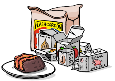
I listen to podcasts a lot on my daily commute, so I hear a few adverts from the forward thinking companies that support this sort of media. One of them is Blue Apron who supply meal ingredients, and the main thrust is always "you get just the right amount of everything you need, so nothing is wasted".

That seems a reasonable thing to say, especially for ingredients that are more niche.

But it got me thinking,.. do you get a big box with everything jumbled together, or is everything individually packed? My idea was based around the latter, so lots and lots of packaging.

The answer to that question is available here if you're interested, a padded box, packaging, lots of cellophane and ziplock bags. It's the modern way!

The Final Frame.

Often I have a frame that I've struggled with, and "Hey Good Looking" was no exception.

The jokes about excessive packaging, so you can see in my first attempt that the focus in the final image was all wrong.

My final frame didnt work

Initially the image was going to be packaging sat in the bin, but I felt that it needed to be linked to the preparation of the meal. I decided to show the used packaging in the background instead, but now the bacon cake is in the foreground, so this is what you look at... it means that the joke gets a little lost.

The revised final frame

The fix required a number of changes:-
 - Add the outer bag to link back to the previous frames.
 - Move the plate so it's smaller and no longer in the middle.
 - Use white out-lining to ensure separation of the key elements.

Facebook Issues

My final point is about the job that Facebook does when displaying images from linked pages. It takes a landscape snap of the middle of the image so anything that's portrait ratio gets chopped off top and bottom. Look at the mess it made when I tried to use it today.

Facebook newsfeed image

I decided I'd had enough of Facebook cocking it up. I made a new image with just the first frame and added the "click to read comic" box. The stats are back up to normal, so I think it worked. Didn't bother using it for Google+ because for some reason it does a good job.

My new Facebook page link image

Anyway, that's it for now, I think I'll continue creating facebook images, and I hope some of you found that useful.