Showing posts with label Joke. Show all posts

Wednesday, 1 November 2017

Posting Your Comics on Reddit (Part 2)

Introduction

In my last blog I talked about the pros and cons (mostly the cons) when using Reddit to promote your comics. But I also wanted to pass on some of my musings about the reason that one of my comics performed so well.

Let’s start off by looking at my submissions:-
Date
Comic
Score
Views
Comments
16th Oct 2017
2 (75% upvoted)
66
0
16th Oct 2017
2 (100% upvoted)
89
0
16th Oct 2017
4 (75% upvoted)
200
0
16th Oct 2017
3 (81% upvoted)
125
0
16th Oct 2017
2 (63% upvoted)
74
0
17th Oct 2017
3 (100% upvoted)
210
0
18th Oct 2017
167 (90% upvoted)
3400
2
19th Oct 2017
98 (81% upvoted)
2700
4
20th Oct 2017
20 (75% upvoted)
301
0
22nd Oct 2017
6113 (85% upvoted)
57.2k
290

What does this tell me?
  • If you look at the score, it shows that you nearly always get down-votes. The percentages look small, but when you start looking at Sauce of Genius, that’s a thousand people expressing their dislike. It reduced my score by a thousand, which impacts how easily it goes into (and stays on) the ‘hot’ page.
  • Comments tend to track Score, it’s not until you get a cartoon on the ‘Rising’ or ‘Hot’ page that you attract the attention of those that feel the need to tell you something.

So, why did “Sauce of Genius” do so well?

The Sauce of Genius

That’s a great question, because I didn’t think it was better than say “The Gas is Greener”. It’s not a bad comic idea, it's drawn quite well and has the following attributes:-
  • It’s relatable, everyone likes sauce.
This generated most of the positive comments, people talking about their favourites and what foods it's good for. Some even talked about alternatives they didn't like.

  • I had altered the label of HP Sauce to read “Brown”. 
Loads of people needed to tell me it was actually called HP, completely missing the point of the joke. In the UK it's all known as brown sauce, I just chose that one because it was so recognisable. This also generates conversations about the UK and how HP was no longer available in the USA.

  • Some of the statements are not true.
OK, here's where people started to really take issues. I took a lot of flak for Buffalo really being named after the place, and even my statement about Tabasco (which was true) was generally rubbished. Way to ruin a joke guys!!
Some asked if my intention was to be as inaccurate as possible, while others were amused that so many were getting hung-up on these details. (It certainly made me laugh)
Others started to get creative and came up with their own fake-sauce-facts. (very funny)
But generally I'm a bad person for doing zero research!

  • One of the pictures appears to portray Thousand Island as a tropical island.
This one probably caused the most friction. Yes, it’s really up by New York, but I never said it wasn't. People seemed to be genuinely insulted by this one. It also generated a lot of discussion about New York and what Thousand Islands is really like.

Lessons Learnt

Although unintended, this comic was a little controversial. At first I was a bit embarrassed that people were finding obvious holes, but it soon started to feel like a joke on the readers when so many were taking it so seriously. It's one way to generate interest, but I imagine it could easily backfire if enough people down-vote it as soon as you post it. You also need thick skin and should resist the temptation to defend yourself.

That aside, I think mainly people could easily relate to it and understood the joke.

Something I'm still uncertain of is whether post images directly into Reddit is better than linking to a comic site.

Monday, 24 July 2017

Cartooning - Don't Ignore the Obvious

Introduction

Recently I had an a comic idea where the joke used a play on the word "wicked". Here it is...

It bombed,.. the big mistake I made here is ignoring the obvious!

Edit 10/08/2017: See fixed version of cartoon.

What Do I Mean?

Possibly like many others, you see this picture and think,..

"Shouldn't the candle be lit at both ends, I mean he's busy ain't he?"

But, burning the candle at both ends wasn't the joke I was going for, it's more subtle than that. The candle has a wick running through it which I'd showed as not lit, to try and veer the reader away from the accepted wisdom. I'd ignored the obvious and tried to be clever.

Learning From Mistakes

Contrary to popular beliefs, it's acceptable to make mistakes, but you should at least try to find out what you did wrong so you could avoid it next time.

I nearly fell into the same trap with this one..


This is one of those jokes that works better spoken than when written down. At first I wrote the line "Hysteria = Length x Wit", but it troubled me. The correct spelling doesn't feature the word "area", so the joke is lost.

I'd already shown various formulae for calculating areas on the blackboard, but I still felt compelled to spell it incorrectly and hyphenated to make my point.

I like it as a concept, but it still doesn't feel quite right when written down.

Wednesday, 21 June 2017

Hey Good Looking - Area 5.1 Cartoon

No hints or tips this week, just a quick blog about "Hey Good Looking", my latest Area 5.1 cartoon, and a mention about how Facebook embeds images in the news feed.

The Cartoon Idea

I listen to podcasts a lot on my daily commute, so I hear a few adverts from the forward thinking companies that support this sort of media. One of them is Blue Apron who supply meal ingredients, and the main thrust is always "you get just the right amount of everything you need, so nothing is wasted".

That seems a reasonable thing to say, especially for ingredients that are more niche.

But it got me thinking,.. do you get a big box with everything jumbled together, or is everything individually packed? My idea was based around the latter, so lots and lots of packaging.

The answer to that question is available here if you're interested, a padded box, packaging, lots of cellophane and ziplock bags. It's the modern way!

The Final Frame.

Often I have a frame that I've struggled with, and "Hey Good Looking" was no exception.

The jokes about excessive packaging, so you can see in my first attempt that the focus in the final image was all wrong.

My final frame didnt work

Initially the image was going to be packaging sat in the bin, but I felt that it needed to be linked to the preparation of the meal. I decided to show the used packaging in the background instead, but now the bacon cake is in the foreground, so this is what you look at... it means that the joke gets a little lost.

The revised final frame

The fix required a number of changes:-
 - Add the outer bag to link back to the previous frames.
 - Move the plate so it's smaller and no longer in the middle.
 - Use white out-lining to ensure separation of the key elements.

Facebook Issues

My final point is about the job that Facebook does when displaying images from linked pages. It takes a landscape snap of the middle of the image so anything that's portrait ratio gets chopped off top and bottom. Look at the mess it made when I tried to use it today.

Facebook newsfeed image

I decided I'd had enough of Facebook cocking it up. I made a new image with just the first frame and added the "click to read comic" box. The stats are back up to normal, so I think it worked. Didn't bother using it for Google+ because for some reason it does a good job.

My new Facebook page link image

Anyway, that's it for now, I think I'll continue creating facebook images, and I hope some of you found that useful.

Thursday, 8 June 2017

The Rule of Threes in Cartoons

My Biker Safety cartoon evolved from the simple drawing of my son's Piaggio scooter into a full comic idea over a number of days. I'd initially planned for three frames, which wasn't a conscious decision, but after coming up with a good punchline image, I found that I couldn't think of a good middle frame.

I decided to put together what I had to see if I could get away with it, but my concerns turned out to be justified. It wasn't working very well in that format.

The first (two frame) version of Biker Safety

I wondered why this was and came up with the following observations:-
  • The pictures are too similar and there's not enough separation (so you look down to the last image too early).
  • There isn't enough misdirection to trick you into thinking the joke is about safety.
  • It doesn't follow the rules of three. (see what I did there?.. no,..ok I'll explain in a bit)

Lies, Damn Lies and Statistics

I like quoting Mark Twain, but before I start talking about the rule of three I thought it might be interesting to review the number of frames used for each Area 5.1 cartoon. I dropped the tally into a bar graph and it became obvious that I primarily use one, three or four pictures per strip.


There's actually more single frame work than I'd expected, but a fair amount of this was computer game themed "filler" cartoons from the first year. Back then I was still trying to ensure a weekly output, I've since given over to "a weakly output" of just a couple per month.

What does this tell us?.. well I'm not sure, perhaps that my preference is for ideas that need a bigger setup. Or maybe that I tend to split more wordy dialogue over additional frames to keep it manageable. But could it be that there's something subtle going on that I hadn't realised?

Three's a Jolly Good Fellow

OK sorry about that, couldn't resist it!.. so what's this rule of three then?

Quite simply it's the idea that things are more memorable if they are in threes. Consider the following famous examples:-
  • Friends, Romans, countrymen.
  • Faith, hope and charity.
  • Stop, look and listen.
  • The good, the bad and the ugly.
Or the Mark Twain quote I used for the title of the previous section. There's loads of them, they all stick in your head and have a certain resonance about them. We could say that three is the minimum number required to create a pattern, but perhaps it's the sweet-spot. Go much higher and it starts to get complicated or inefficient.

It's commonly used in humour and to illustrate I've included this great joke example from Laura Kightlinger that uses a shocking third element..

"I can’t think of anything worse after a night of drinking than waking up next to someone and not being able to remember their name, or how you met, or why they’re dead."

  1. Starting Point (waking up next to an unknown person)
  2. Misdirection following a common theme (can't remember how you met)
  3. Punchline (or why they're dead)

Fixing my cartoon

So I went back to the drawing board, desparate to find my misdirection element, and it wasn't until I switched from safety to other biker requirements that I finally found the answer. But it meant I had to finally give one of my characters a name.

The missing middle element

I hope you found that as interesting as I did,.. if you haven't already seen it, check out the finished cartoon here --> http://area5-1.webcomic.ws/comics/67/

Thursday, 27 April 2017

Same but Different

Frame to Frame

Quite often in cartoons you get the same frame repeated multiple times, and you'll see the character has moved to provide some degree of interest. But look more closely, the pros will vary more than that, redrawing the frame or changing other things about the background.

But in the digital world is way to easy too add some variation by zooming in.

Add variation by zooming
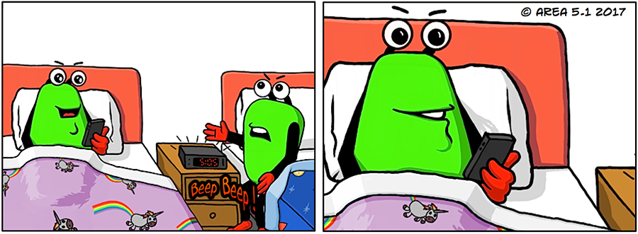
In the example above I took the same artwork, altered the LGM (little green man) holding the phone and then changed the shading on the bedspread. It certainly looks better than just repeating the frame. Also in the last frame the 2nd LGM doesnt talk, so there's no point showing him.


Working On The Dialogue

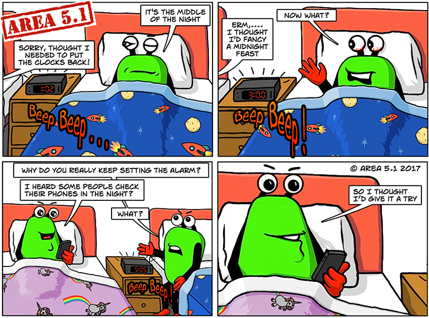
Unfortunately sometimes you can have a nice idea but the dialogue can let it down. Here's my first example with its simple idea of the LGM with the phone setting alarm multiple times in the night to annoy the other.


Version 1 - Dialogue needs some work
The more observant will also notice the shading on the bedsheet is simple giving a very odd look. It just didn't look like fabric. But the biggest problem was the dialogue was just too simple.

Here's the re-worked version..


The Final Version - Phon-etiquettes

The drawing difference is subtle, the main change is the way that the LGM with the phone tries to hide the real reason why he keeps setting the alarm.

The finished cartoon here -> http://area5-1.webcomic.ws/comics/64/

Wednesday, 12 April 2017

Mend and Make Do

Inspired By The Goggle Box

I think I'm very guided by what I've seen on TV. Like most of us, I grew up watching it and I think we have expectations about how one show links back to another. A cliff-hanger gets revisited, replaying what had happened at the end of the previous show.

The cartoon world doesn't tend to do this much because it wastes a frame when you revisit an idea. It's all about being economical with your art. But when Mo, who's the amazing artist behind the Riddick Q Loss Tales cartoon read Drop the Anchor she made the comment, "Personally I think we are almost their slaves now."

That was all the inspiration I needed, but I broke those unwritten rules and built the first frame using elements from the previous cartoon.


Area 5.1 - Enslaved Cartoon

Plagiarise Yourself

Shiela and I have discussed re-using old artwork in cartoons a few times. It feels like cheating, but I don't redraw my logo every time (and that's OK), so surely everything's rife for pillaging. The notion of "Mend & Make Do" is an old wartime ethic to deal with shortages. It's still as relevant for most of us today, only these days it's time we're short of.
 
There's a lot of "recycled" images in use here, quite obviously that first frame's taken from the end of the previous cartoon. The TV mask has been used quite a bit now, I like the 70's feel about it, and then there's the sofa scene that I've used quite often. The hand holding the phone is reworked from the Funstreak cartoon You Have A Match, and mostly all I've done is alter the hand a little and change the screen contents.

Doesn't seem to bad from just a few hours work! (What do you think?)

The link to the cartoon -- http://area5-1.webcomic.ws/comics/63/

Friday, 24 March 2017

Madam I'm Adam

When You Got Nothing

My previous blog was all about inspiration and it included an example of where I'd recently found it. But sometimes I find I have the desire to draw, but there really is nothing in the tank. They seldom come fast with me, and from what I'd read this is a common issue with creatives. You can generate loads of good ideas at first, but then you run dry. Of course there are plenty of folks out there that can just crank the work out, and they make it seem easy too!

So, how do you break out of your funk?

By far the easiest thing to do when you're trying to find inspiration is to look at work by other people. I tend to target popular culture and well known works & ideas because it fits in with my main joke driver, WIKT ("wait, I know this"). This is what your mind subconsciously says when you see a joke. It's a powerful idea and it tends to appeal to our sense of nostalgia and belonging.

So earlier this week, knowing I had to get another Area 5.1 cartoon out, I decided to parody one of the greats. Something so well known that even the non-cultured would recognise.

Dancing on the Ceiling

The Creation of Adam from the ceiling of the Sistine Chapel; my idea was a simple one, create a parody by replacing Adam and God with my aliens.

Starting Out - Overlaying my characters


I considered using my "Zambo the Great" character as god,.. it seemed fitting, but I haven't actually drawn this figure yet. Instead I stuck with the recognisable LGM's and mused that "god created man (alien) in his own image - Genesis 1:27."

[nb. I know, I don't normally quote scripture, but I was feeling googly!!]

After looking more closely at the painting I noticed that the god figure (let's call him Zambo) seems to be held aloft by a number of (what I assume are) mortals. A collection of men, women and children surrounded by some sort of protective cloak. I had to somehow keep that idea.

The Complete Artwork


My answer was to add more LGM's, clearly straining to hold the big guy up, and as they are flying, well they needed rocket boots!! The cape looks a little abstract now, but at the time I didnt really understand what it was meant to be. (A monsterous shell, or a hang-glider perhaps?) I coloured the mortals a darker green to push them into the background.

I think it turned out OK.

Cranking it up to Eleven

Rather than just leave it as a parody I decided to try and make it a joke.  My first thought was to have a frame before this with LGM looking up at the bathroom ceiling and saying something like, "What do you think, too much?"

Clearly the original artwork's location had struck a chord with me!

Shiela had just asked me for advice about a cartoon she was working on, so I ran it by her. It became clear that there was a better line I could use that worked on the assumption that one of them had gotten carried away. It also made more sense why they'd be painting in the first place.

I came up with this single frame idea where the artwork was actually graffiti on a concrete underpass column.


The completed cartoon

The final changes I made were to alter the green on Zambo and Adam so that it was different from my two figures in the foreground. Then in order to get some separation from the background, I added a white outline to the foreground figures. It's subtle but it works well.

Visit the final cartoon here -- http://area5-1.webcomic.ws/comics/61/

Monday, 13 March 2017

When Inspiration Strikes

Fickle Inspiration

Even the most creative people go through dry patches, life gets in the way and the mind gets filled with mundane things that just have to be done. Other-times you feel like you have space to be creative, but you get the artist's version of writer's block. This might feel really bad when you're trying to keep something like a webcomic moving, but it's best to recognise it for what it is and not be so hard on yourself.

Generally speaking it's hard to make ideas happen, and when you do they can often feel contrived and of low value. But inspiration does strike in many ways, it's just the case of recognising when a good idea comes along and finding a way to use it.

When it Strikes

The other week a lady (let's call her Kate) expressed interest in me on a dating site. I'm not single anymore, but I still checked out her profile from a vanity point of view.

NB. A profile generally contains a little bit about that person and some photos. You'd expect to see pictures of that person, but you'd be surprised how often you find holiday scenes, dogs/cats, inspirational posters or bunches of people which leave you wondering which person you should be looking at. I know blokes are as bad, they pose with freshly caught fish, post photos of their motorbikes, tattoos and many of the things the ladies do.

Anyway the thing that amused me was Kate had posted photos of some cakes fresh from the oven, her dog wearing one of those funnel shaped collars, a couple more of the dog and two less than flattering photos of herself. (I've included the first two below)


Kate's Cakes

Kate's Dog

I don't want to make Kate the butt of a joke, but it did make me feel that there was an idea here that needed to be explored. So I looked around for other ideas, pulled them together for this comic and the final picture was added to make the joke (nobody was actually crazy enough to use a photo like this!!).


Funstreak - You Have a Match

I should state for the record Kate doesn't have a verruca or a drinking problem (as far as I know). She's probably a very nice person who just lacks self confidence.

Anyway, I hope you enjoy the peep into the world of online dating and find this blog on inspiration useful. Here's the link to the comic.. http://funstreak.webcomic.ws/comics/7

Enjoy!


Tuesday, 7 March 2017

Cartoons - Breaking Up Frames

Introduction

I recently saw a product from a health store with the bold claim "see the difference in seven days", so I bought some to try.

A week later I was asked, "has it made a difference", and while I felt it was too early to say definitively, I couldn't help but make this joke. Then in the absense of any other Area 5.1 ideas I decided to turn it into a cartoon, but it gave me a few layout problems that I wanted to share.


Designing the Layout

My intention was to go for two simple page wide frames, no background images, just a bottle of medication and my two LGM's (little green men). It seemed simple enough, but the second frame troubled me. I wanted him peering into the pill bottle, but it then felt like I was giving the joke away before I'd really had chance to set it up.

Area 5.1 Original Frame 2

The second problem with this frame is overlapping dialogue, the reader is forced to skip left and right to consume the information in correct order, even though it is arranged to read down the page. I felt that splitting the frame into two was perhaps a better option.

The Final Image


Here's what I ended up with..


Area 5.1 - A Weak Claim
I think the change reduces the chance that the reader will jump ahead. The dialogue still works because the clipped tails point to the next or previous frame providing a reference to who's talking. But, it did mean showing the LGM's facing different directions (or they merge together in the middle like conjoined twins), so a little bit of effort was required to ensure the reader could tell them apart. Traditionally I use two body shapes, but it doesn't work well enough here. Instead I resorted to two distinct styles of eye.


See the web comic here: http://area5-1.webcomic.ws/comics/60/

Tuesday, 21 February 2017

Shooting the Breeze

Introduction

The cartoon was inspired by an upload from a fellow cartoonist who had in turn been inspired by a scene she'd witnessed in a store (or shop if you're english). The cartoon is called 'Spoiled Princess' (http://second-puberty.webcomic.ws/comics/573/)

It's a simple idea, a child wants something that she's seen and like many modern parents her Dad caves in. It got me thinking about what might happen if the child wanted something inappropriate.

The Drawing

I decided to illustrate this using the idea of two parallel father and son scenes with the initial idea of a young alien wanting a Death Star from Star Wars. I thought that if I demonstrated what damage a human boy could do with something relatively harmless (like a BB Gun), then I could leave the reader to imagine for themselves what the alien boy could do with a planet killer.

I wanted to find a way of doing this that didnt use words, so I imagined what a back garden would look like a few days after the boy had taken a BB Gun home. What sort of damage would you see? Initially I brainstormed some ideas and then pulled together a rough sketch of the garden with imported images from the web.  Once planned, I redrew the elements I needed.

Area 5.1 Cartoon - Shooting the Breeze

I was careful to make the two father and son frames to look as similar as I could, while still having them different. I came up with a new design of alien using the same eyes, mouth and ears and coloured them purple so they wouldn't be confused with the original alien design.

See the web comic here: http://area5-1.webcomic.ws/comics/59/

Thursday, 26 January 2017

Exploding The Truth - Microwave Joke

Area 5.1 Comic about Microwave Ovens

I had this idea about the notion of never putting anything metal into a microwave oven because people think it would explode. My thought being that the people who think this aren't aware of what the inside of the oven is made of.

Area 5.1 - Expoding the Truth Cartoon

Clearly it helps to have a bit of an understanding about how a microwave works.

OK, disclaimer - if you are going to put metal inside then just read up about what to do and what not to do (unless you want a light-show), and remember running it without any food in (or very dry food) can be worse.

You can't beat a bit of jeopardy!

http://area5-1.webcomic.ws/comics/57

Wednesday, 28 December 2016

Cartoons - How Much Do You Need To Draw?

Introduction

As many would agree, we approximate and simplify for lots of reasons. And the same is true when drawing, adding excessive detail doesn't improve the overall image, especially if they're too small to be seen clearly. Similarly the detail might be not visible at all, it may be concealed in darker areas or partially obscured by closer objects. As the artist we know the particulars are there, but we also know the brain does a great job in filling-in the missing parts. So, we tend to ignore the desire to make it "perfect", but not just because it's a waste of time and effort.

Art's all about interpretation, if we wanted an exact image we'd take a photo! But even a skilled photographer will typically reduce the depth of field to blur out the background and remove detail from that part of the image. It's all about instructing the viewer in a subconscious way what's important, and telling them which elements they should be looking at. (Yes, we manipulate!!)

Keeping It Clean

It's quite obvious when cartooning that details are missing, it's why we see so many good examples with just plain white backgrounds. The drawing is all about driving your idea, so if it doesnt support that, or add required context then it's just getting in the way. You need to get your idea over quickly and efficiently, not "turn-off" your reader by making them read or view extra elements that might confuse or detract from the main idea. It's worth considering that you're not just giving yourself extra work if you take things too far!

By way of example let's consider my quick christmas comic that I created the other day..

Seasons Greetings - Area 5.1 From Christmas Day
It's quite a simple idea, but it had a few problems that needed fixing before I could use it. Let's take it apart and I'll run through my thought processes.

Seasons Greetings - Step By Step

1. The most important thing is that the salt and pepper pots are recognisable, and because I'd used the Area 5.1 character colours there was real danger that they looked too much like the LGM's (little green men). The shape is very similar, they have recognisable mouths, but they're just missing limbs and eyes.

After I'd added the mouths, I started to think that pot holes weren't enough. They had turned into simplified versions of the Area 5.1 characters and lost too much of their condiment identity.


Seems to be neither one thing or another
OK, I could have written "Salt" on the left one, and "Pepper" on the right, but that's way too blunt for me. What I needed was context,.. show where they belong and the brain removes any ambiguity. But what should I draw?

The main place you'd expect to see these guys is on a dinner table, but I didn't want to draw a gingham tablecloth in perspective and then have to consider how much of the table should be included. No, I needed a single object that was immediately recognisable to add the missing reference point.

2. I started out trying mustard pots and gravy boats, but once you'd placed them behind, partially obscured they lost their identity. In the end I opted for the Heinz ketchup bottle with it's traditional bottle shape and it's distinct label. The latter giving me some scope for customisation, allowing me to replace the brand name and alter a few of the smaller details.


The missing context

BUT, I heard you cry, "Surely you're adding details by doing this!!"....

....well that's just the thing, because the brand is so recognisable your brain doesn't focus on it. It tells you "that's ketchup" and then moves on. Hopefully you now see a table because the raised position of the bottle implies perspective.

3. That was pretty much it - I avoided shadows on the table top and kept the shading subtle to make your brain to do more work. Also, I knew I was going to add the speech bubble in ComicLife so I just needed something that screamed christmas. So I added the christmas bells and then considered whether I needed to added the comic title to the image too.

As it was an exercise in brevity I decided to keep it simple. The title (which is the joke), is on the web page only. I'm still divided on whether this was the correct thing to do.