Thursday 27 April 2017

Same but Different

Frame to Frame

Quite often in cartoons you get the same frame repeated multiple times, and you'll see the character has moved to provide some degree of interest. But look more closely, the pros will vary more than that, redrawing the frame or changing other things about the background.

But in the digital world is way to easy too add some variation by zooming in.

Add variation by zooming
In the example above I took the same artwork, altered the LGM (little green man) holding the phone and then changed the shading on the bedspread. It certainly looks better than just repeating the frame. Also in the last frame the 2nd LGM doesnt talk, so there's no point showing him.


Working On The Dialogue

Unfortunately sometimes you can have a nice idea but the dialogue can let it down. Here's my first example with its simple idea of the LGM with the phone setting alarm multiple times in the night to annoy the other.


Version 1 - Dialogue needs some work
The more observant will also notice the shading on the bedsheet is simple giving a very odd look. It just didn't look like fabric. But the biggest problem was the dialogue was just too simple.

Here's the re-worked version..


The Final Version - Phon-etiquettes

The drawing difference is subtle, the main change is the way that the LGM with the phone tries to hide the real reason why he keeps setting the alarm.

The finished cartoon here -> http://area5-1.webcomic.ws/comics/64/

Wednesday 12 April 2017

Mend and Make Do

Inspired By The Goggle Box

I think I'm very guided by what I've seen on TV. Like most of us, I grew up watching it and I think we have expectations about how one show links back to another. A cliff-hanger gets revisited, replaying what had happened at the end of the previous show.

The cartoon world doesn't tend to do this much because it wastes a frame when you revisit an idea. It's all about being economical with your art. But when Mo, who's the amazing artist behind the Riddick Q Loss Tales cartoon read Drop the Anchor she made the comment, "Personally I think we are almost their slaves now."

That was all the inspiration I needed, but I broke those unwritten rules and built the first frame using elements from the previous cartoon.


Area 5.1 - Enslaved Cartoon

Plagiarise Yourself

Shiela and I have discussed re-using old artwork in cartoons a few times. It feels like cheating, but I don't redraw my logo every time (and that's OK), so surely everything's rife for pillaging. The notion of "Mend & Make Do" is an old wartime ethic to deal with shortages. It's still as relevant for most of us today, only these days it's time we're short of.
 
There's a lot of "recycled" images in use here, quite obviously that first frame's taken from the end of the previous cartoon. The TV mask has been used quite a bit now, I like the 70's feel about it, and then there's the sofa scene that I've used quite often. The hand holding the phone is reworked from the Funstreak cartoon You Have A Match, and mostly all I've done is alter the hand a little and change the screen contents.

Doesn't seem to bad from just a few hours work! (What do you think?)

The link to the cartoon -- http://area5-1.webcomic.ws/comics/63/

Sunday 9 April 2017

My Perspective on Vanishing Points

Adding Some Perspective

Following on from my last post about scene types, today's is all about drawing in perspective using vanishing points. My last comic showed a factory scene in one of the frames which I used perspective to show depth and give an idea of space.

A vanishing point is a point in the image where a set of parallel lines intersect in the distance. Think about railway lines converging at the horizon and you'd have a single vanishing point perspective.


Single Point Perspective.
(from Wikipedia)
It's quite easy to see that the vanishing point here is right in the middle just below the trees.


Using Double Point Perspective

My cartoon was set in a factory and centred around the idea of a robot taking revenge for what was being said by a TV anchorman. I'm going to use two point perspective to enable me to draw a machine that fits in with what I'd already drawn for the background. The idea is that the machine is going to be making these bins and the robot will be stacking them up.

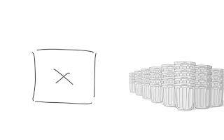
Starting Point - X marks the spot.

I'd already made a stack of bin or garbage cans in the picture, and these had been overlapped and reduced in size so that they give the impression of perspective. The box with the X is where I want to draw the machine.

The shape of the bins follows two sets of vanishing points

I'm showing the lines that run off to the two vanishing points on this diagram. Both points should be on the horizon line which I've chosen as roughly mid point. And the blue point is well over to the right, off the page.


Add vanishing point lines for the machine

Now I've added vanishing points for the machine (making sure they are on the same horizon line). My tip would be to not add too many at this point or it'll get confusing, but try and mark out lines to help build the basic shape. These guide lines will form the basic of all horizontal lines in the box I'm about to draw.


The completed machine with shading

Add additional guide lines as you go where you need to add details. You'll find the angles often look a little odd, but stick with it, it'll look fine once it's done. My machine here is simple box with a conveyor spur, a control box and a fan unit. The writing on the sign is done in a similar way, add red guide lines and then scale the individual letters to fit.

Finally, I filled with colour shades of grey , then added a few extra details like switches and hatches. The additional of a bin on the conveyor ties it all together.


The completed frame ready for dialogue

Once the backdrop has been completed you can add your cartoon characters, and here I've used the white outline trick to give them a bit of separation. I've also kept the background free of colour to stop it from grabbing too much attention.

I have also added a little bit of detail that can't been seen on the published cartoon, but if you look at the completed frame you might find my slight obsession drawn within.

Strictly speaking I should have used the same trick when drawing the robot, it's close, but as long as the vanishing points converge on the same horizon line it should look OK.

See original cartoon here -- http://area5-1.webcomic.ws/comics/62/

Wednesday 5 April 2017

Making a Scene

Introduction

I like to approach my work as though I'm making a film and these cartoon frames are it's storyboard. You don't have to do this, it's just part of my style, but I think it makes it look more interesting this way,.. more cinematic.

I will use of the following basic camera shots to help drive the story or idea:-

Long Shot Medium Shot Close-up Extreme Close-up

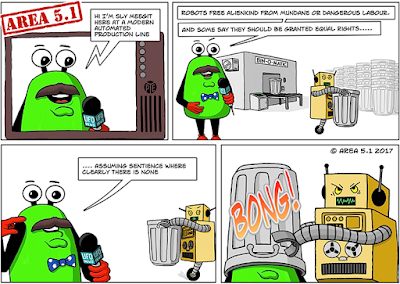
I'll start off by showing my latest Area 5.1 cartoon which I will use as an example..

Area 5.1 Cartoon - Drop the Anchor
It's based on a discussion over the growth of AI and whether we thought robots would gain emancipation or always be treated like objects. There are some parallels with the slave trade in the 19th century and I think the real barrier to freedom (as it was then) is breaking free from ownership.

The Establishing Shot

It's probably more correct to call it an opening scene. It's there to serve as an introduction so the reader has some context for the dialogue. This example is unusual because there are two establishing shots.

Opening Shot - Frame 1.

The first frame is a close-up shot showing a TV screen. It tells the reader this is a news report and it introduces the anchorman as the main character. The dialogue bubble supports this using a broadcast (lightning bolt style) tail.

Opening Shot - Frame 2.

The second frame still shows our main character, but we're using a long shot to introduce the two main plot elements. The rubbish bins (or garbage cans) and the robot worker. (Note, I also show a factory background to add context to the story)

Removing Background Details

In the third frame I wanted to show the main character and the robot's reaction to what he was saying. I decided to not show the background because I wanted to keep the image looking uncluttered, and to focus the reader on the two characters.

It's left a lot of negative space and I did consider moving the two closer together and reframing as a medium shot. But I wanted to show that the space between had just been bridged by the robot over-hearing the anchorman's monologue.


The Final Shot

The final frame is where it's typical to resolve your story or joke. This image is a medium shot type, focusing on the robot's act of retrobution and I've added a 'Bong!' to highlight the action. Again, no background is needed, it just doesnt add anything to the story.

In Summary

There's plenty of cartoons that don't use these techniques. Most of the newspaper cartoon strips just use a mixture of medium or long shots with simple drawing to cope with lack of colour and reduced image size. But contrast this with a superhero comic book and you'll see a huge difference.

But it's all about style, there's no wrong or right,.. but I hope I've given you something to think about.