Wednesday 21 June 2017

Hey Good Looking - Area 5.1 Cartoon

No hints or tips this week, just a quick blog about "Hey Good Looking", my latest Area 5.1 cartoon, and a mention about how Facebook embeds images in the news feed.

The Cartoon Idea

I listen to podcasts a lot on my daily commute, so I hear a few adverts from the forward thinking companies that support this sort of media. One of them is Blue Apron who supply meal ingredients, and the main thrust is always "you get just the right amount of everything you need, so nothing is wasted".

That seems a reasonable thing to say, especially for ingredients that are more niche.

But it got me thinking,.. do you get a big box with everything jumbled together, or is everything individually packed? My idea was based around the latter, so lots and lots of packaging.

The answer to that question is available here if you're interested, a padded box, packaging, lots of cellophane and ziplock bags. It's the modern way!

The Final Frame.

Often I have a frame that I've struggled with, and "Hey Good Looking" was no exception.

The jokes about excessive packaging, so you can see in my first attempt that the focus in the final image was all wrong.
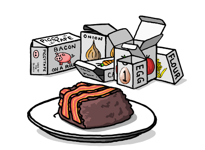
My final frame didnt work

Initially the image was going to be packaging sat in the bin, but I felt that it needed to be linked to the preparation of the meal. I decided to show the used packaging in the background instead, but now the bacon cake is in the foreground, so this is what you look at... it means that the joke gets a little lost.

The revised final frame

The fix required a number of changes:-
 - Add the outer bag to link back to the previous frames.
 - Move the plate so it's smaller and no longer in the middle.
 - Use white out-lining to ensure separation of the key elements.

Facebook Issues

My final point is about the job that Facebook does when displaying images from linked pages. It takes a landscape snap of the middle of the image so anything that's portrait ratio gets chopped off top and bottom. Look at the mess it made when I tried to use it today.

Facebook newsfeed image

I decided I'd had enough of Facebook cocking it up. I made a new image with just the first frame and added the "click to read comic" box. The stats are back up to normal, so I think it worked. Didn't bother using it for Google+ because for some reason it does a good job.
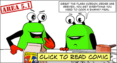
My new Facebook page link image

Anyway, that's it for now, I think I'll continue creating facebook images, and I hope some of you found that useful.

Thursday 8 June 2017

The Rule of Threes in Cartoons

My Biker Safety cartoon evolved from the simple drawing of my son's Piaggio scooter into a full comic idea over a number of days. I'd initially planned for three frames, which wasn't a conscious decision, but after coming up with a good punchline image, I found that I couldn't think of a good middle frame.

I decided to put together what I had to see if I could get away with it, but my concerns turned out to be justified. It wasn't working very well in that format.

The first (two frame) version of Biker Safety

I wondered why this was and came up with the following observations:-
  • The pictures are too similar and there's not enough separation (so you look down to the last image too early).
  • There isn't enough misdirection to trick you into thinking the joke is about safety.
  • It doesn't follow the rules of three. (see what I did there?.. no,..ok I'll explain in a bit)

Lies, Damn Lies and Statistics

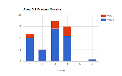
I like quoting Mark Twain, but before I start talking about the rule of three I thought it might be interesting to review the number of frames used for each Area 5.1 cartoon. I dropped the tally into a bar graph and it became obvious that I primarily use one, three or four pictures per strip.


There's actually more single frame work than I'd expected, but a fair amount of this was computer game themed "filler" cartoons from the first year. Back then I was still trying to ensure a weekly output, I've since given over to "a weakly output" of just a couple per month.

What does this tell us?.. well I'm not sure, perhaps that my preference is for ideas that need a bigger setup. Or maybe that I tend to split more wordy dialogue over additional frames to keep it manageable. But could it be that there's something subtle going on that I hadn't realised?

Three's a Jolly Good Fellow

OK sorry about that, couldn't resist it!.. so what's this rule of three then?

Quite simply it's the idea that things are more memorable if they are in threes. Consider the following famous examples:-
  • Friends, Romans, countrymen.
  • Faith, hope and charity.
  • Stop, look and listen.
  • The good, the bad and the ugly.
Or the Mark Twain quote I used for the title of the previous section. There's loads of them, they all stick in your head and have a certain resonance about them. We could say that three is the minimum number required to create a pattern, but perhaps it's the sweet-spot. Go much higher and it starts to get complicated or inefficient.

It's commonly used in humour and to illustrate I've included this great joke example from Laura Kightlinger that uses a shocking third element..

"I can’t think of anything worse after a night of drinking than waking up next to someone and not being able to remember their name, or how you met, or why they’re dead."

  1. Starting Point (waking up next to an unknown person)
  2. Misdirection following a common theme (can't remember how you met)
  3. Punchline (or why they're dead)

Fixing my cartoon

So I went back to the drawing board, desparate to find my misdirection element, and it wasn't until I switched from safety to other biker requirements that I finally found the answer. But it meant I had to finally give one of my characters a name.

The missing middle element

I hope you found that as interesting as I did,.. if you haven't already seen it, check out the finished cartoon here --> http://area5-1.webcomic.ws/comics/67/