Sunday, 3 January 2021

Using Lists in Comics

Intro

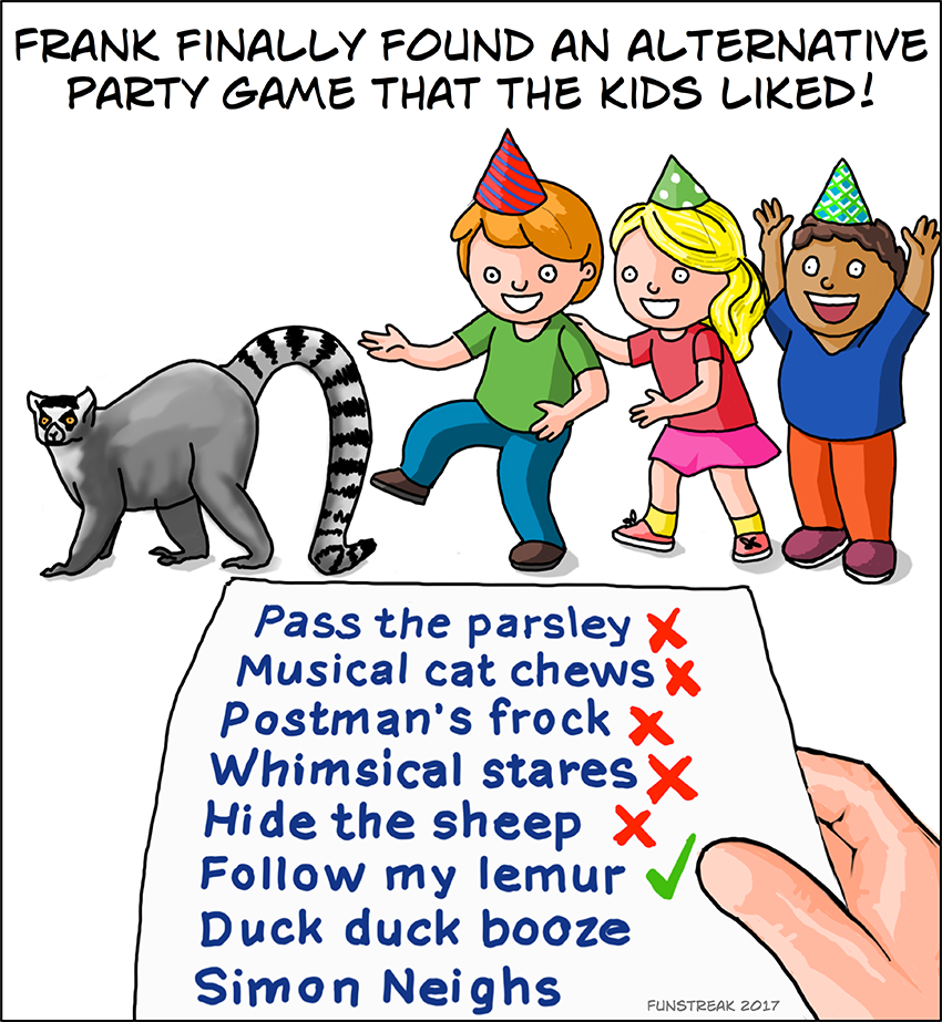
One of my favourite things to do with a comic is to take a basic idea and come up with a list of related things that go with it. Sometimes it's obvious that I'm doing that, because the drawing is in the form of an actual list.

One of my favourite list comics

Let's Be More Subtle

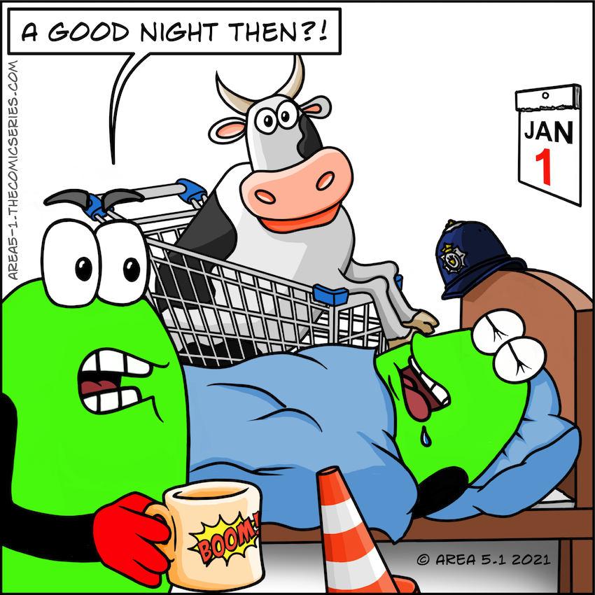
It doesn't have to be written. In my recent Area 5.1 cartoon I decided to build an image around my list instead. It less obvious and rewards the reader when they spend time searching through your drawing.

A less obvious list

Here, the list is based around stereotypical objects collected during a night out. I think I also had in mind to include a street sign, but I started to run out of space. The traffic cone definitely had to be there.

I hadn't intended putting the cow in the shopping trolley/cart, but I didn't have room to put them next to each other. I think the result is funnier for it.

Finally, I added the Jan 1st calendar on the wall to make it relevant to the new year. So happy new year folks.

Friday, 24 July 2020

Cartooning - Looking For Improvement

Sometimes you can come up with a good idea, you've drawn it to your best ability, but it just doesn't look right. It might be that there's a problem with the logic, or the scale, or just something that goes against our pre-concieved ideas about how something should work.

Often we don't find out about them until it's too late.

What's Not Right!

The car on the left is the original drawing which was meant to demonstrate my pointless invention, the pizza wheel. The more I looked at it, the more it just looked wrong, and it doesn't take a genious to realise this italian bread based food couldn't possible hold a car up like that.

The Original Image The Corrected Image
The corrected image not only looks more convincing, but it drives home (excuse the pun) the idea that using a pizza for a wheel is stupid.

Scale Issues

Sometimes you can put images together that bind with some people because they have a very fixed idea in their head of relative size. I have a few examples of this.

Example 1
This image was copied from a picture I found on a google image search and I wanted to replace their giant robot head with that of my comic hero, Bender. Then I threw in a load of other sci-fi elements in amongst the junk, plus an old washing machine (just because).

Bender's Head Problem

Now, the Death Star wasn't a problem, because the mind can reason that it's far away. But a giant Bender's head started to raise questions as to how big my little green men are. To be honest, I hadn't given it much thought, it was just a tribute. It could have easily been fixed by adding "Oversized parts, our speciality" to the sign.

Example 2
The next example was posted on Reddit. I hadn't really given relative sizes much thought, and my ignorance got the better of me. (And boy do those guys let you know when something's wrong!)

Can You Spot It?

 Okay, here's the second from to Starwars - A False Hope. I just needed to make the scene look congested, so I threw in as many vehicles as I could find. (some I'd already drawn in previous cartoons). Can you spot which one is wrong?

Well I drew one of these Juggernaut Carriers from the Clone Wars, but my reference image had no figures for scale, so it's way too small. Easy mistake to make, but the ubber geeks are very defensive about their canon.

That little mistake gained enough down-votes so that the comic was essentially buried!

So What's The Answer

  1. Consider your audience, are they picky?
  2. Know/understand what you are drawing.
  3. If you break the rules, have a reason or explaination.
  4. Review your unfinished work with a friend.
  5. Ask yourself the question "is there anything wrong here?"

Monday, 29 June 2020

Fan Art (...and how I got it)

Introduction

As a small-time, tin-pot, have-a-go comic artist, there's nothing better than getting a bit of recognition for the time and effort I've spent producing stuff. We give it away for free, so getting the odd word of encouragement really goes a long way.

I'm very lucky, I've had a few artists recreate my Area 5.1 aliens as fan art.

My first fan art created by Pip Another fan art from Amalock1
A recent feature in McGrenivan's Comic

It's fantastic to get featured like this, and it seems that my opening comic really appealed to people.

How to get Fan Art

Well, exactly how you go about getting fan art is unclear. I can't tell you what to do, but I can go through some of the things that possibly resulted in these artists taking the time to honour me this way.

These are:-
  1. Have characters that are unique and easily recognisable, no matter what drawing style is used.
  2. Be supportive to other artists, especially those who are following their own path.

Be Unique

I do a couple of cartoons, Area 5.1 and Funstreak, and you'll notice that all my fanart come from Area 5.1, and that it's easy to recognise my characters. I use relatively simple shapes and colours that stand out. That green is very unnatural and all pieces of work use that exact same colour along with the red hands and feet.

In short, my Little Green Men were designed to be simple.

My first Character Sketch


Be Supportive

Secondly, you need to get into the community spirit and support new artists. Most don't really know what they're getting into and find that the busy world of a cartoon site means their work quickly moves off the main page and gets lost in the huge amounts of work from established toons. Trying to get noticed is difficult, especially if you don't fit in with the typical popular content. It's so easy to associate lack of comments with the idea that your work isn't very good.

Looking at the artist comment that McGrenivan submitted with his Comicbook Ad parody the sentence that jumped out at me was,..
"Special thank you to a few guys who have inspired me to continue this otherwise fruitless venture"
Now to me, that seems crazy coming from such a talented and humorous cartoonist. If you've not seen his work then please check it out,.. and more importantly add a few comments here and there. That's really all I did,.. I'm just passing on what Paztoid did for me when I first started out, and I remember how it kept me going when I doubted myself.

Share the love!

Saturday, 4 January 2020

Choosing Cartoon Frame Dimensions

Introduction

Multiple frame cartoons often require quite a bit of planning and pre-design in order for the frames to successfully fit together. It gives you a traditional comic page style look and they tend to be interesting and varied. Often I have created a mock-up, a bit like a thumbnail as a way of working out the aspect ratio of each frame drawing, and decide how much space is needed for text.

Once I have all of my images drawn up, I can replicate the frames in ComicLife and put it together along with the dialogue. Here's a few that I've created in the past..

Some of my traditional examples

This was great, until you start to look at the modern mobile friendly sites and how our multi-frame images now become a problem.

Welcome To Instagram

Sites like Instagram are designed around the mobile phone, and they are the modern way that people consume. We'd be foolish to ignore this as a place to upload our cartoons, but there's a few things to be aware of:-
  1. Consider that everyone is going to be viewing on a 5 inch screen, so it doesn't make a lot of sense to upload as a single traditional image if you have multiple frames. Images will be too small and any dialogue will be illegible. (So, upload your frame images as a multi-image posting.)
  2. Instagram reformats uploaded images as a square picture, only it's not very smart about it. Any rectangular pictures will be cropped and you will have no control over how it does it. (Time to switch your frame aspect ratio to 1:1 square.)

Dare To Be Square

While I admit a square frame doesn't look as nice, it makes life easier in lots of way. Planning is easier, everything's square, so it's just a matter of deciding how to fit inside a standard layout. Odd number of frames still don't fit together that well, but it's no more a challenge than before. The comic sites are also becoming more mobile friendly, so it makes sense to ensure that you can fit everywhere.

Here's a couple of odd and even frames examples..

Some of my square frame examples

So, if you haven't already switched to square frames, what are you waiting for?

My latest cartoon available here --> http://area5-1.thecomicseries.com/comics/95/

Wednesday, 11 July 2018

Cartooning - Drawing the Crowds


Intro

A couple of years ago I blogged about drawing a crowd of santas at a party. I'd included a link to Tom Richmond's article about drawing a crowd scene, but the two scenes weren't very alike.

Latest Funstreak showing crowd in the background

My latest Funstreak cartoon uses many of the techniques discussed in Tom's tutorial, but in a simplified way. This doesn't mean you don't need to put much thought into it. It's well worth considering the dynamics of a crowd as you draw.

Stepping Through the Process

A crowd of people might just be a bunch of ovals to represent faces, but there's a number of things to do in order to make it look convincing:-

1. First we need to consider the density within the packing. People stand shoulder to shoulder, or with slight overlap, which leaves some gap between their heads.

Spacing Between Heads

2. The people behind will position themselves between the heads of those in front to get the best view. This gives a loose hexagonal packing pattern when viewed from above, or if the crowd is on a banked surface.


Loose Hexagonal Packing

3. People are also different heights and sizes, and tend to bunch in an irregular way, so we need to randomise the pattern a little. (I've also reduced the overlap heights.)

Randomising Positions

4. Faces at the top of the crowd block will appear smaller than those at the bottom. This establishes distance. Try to keep the size change a linear progression, so work on no more than two rows at a time to help keep consistency.

Using Reduction - Each Row Back is 90% Size


4. The usual distance effects will apply, so details will diminish and colours may darken or desaturate. In my example I didn't add any details because they're too far away, but I did add a little cell shading.

The Example From My Cartoon
 You can also see that I packed the crowd much tighter than in my previous examples. I really wanted a sea-of-faces with bodies only really visible on the front few rows.

Wednesday, 20 June 2018

Getting To The Point

Introduction

When you start cartooning you soon realise ideas come in all sorts of ways, but this is the first one to come to me in a dream,... I could see one of my son's friends skateboarding past the house holding onto a rocket by way of propulsion. (It's perhaps best not to analyse this dream for any meaning!)

.. anyway, he got a little way past the house and then let go of the thing. It then arced across the sky towards a housing estate. I have no idea what happened after that, but the uncertainty and the jeapardy appeal to me. I really don't need to know!

My main challenge to take this idea and turn it into a comic using the minimum number of frames.

Keeping Frame Count Low

In the past I've wanted to get complex ideas across, or have a wordy dialogue. This has often pushed me to draw way more frames than I'd wanted, or needed to. I just need to get to the point.

So taking a leaf from writers, I've decided to cut the wind-up and get straight to the point. This means distilling the idea and my original humour angle into just what's important.

Consider my first notes:-

Frame 1: Scene starts with alien #1 riding skateboard, holding rocket.
Alien #2: "Hey where did you get that?"
Alien #1: "It's one of the rockets from the ship."
Alien #2: "Let me try."
Frame 2: Alien #2 starts riding skateboard
Alien #1: "Okay, just don't let go of the rocket."
Frame 3: Skateboard hits a stone.
Frame 4: Alien #2 takes a tumble and lets go of the rocket.
Frame 5: Alien #2 gets up thinking everything is OK, while rocket heads towards their ship.

My fix:-
  • Drop frame 1,.. we don't need to know both aliens have tried skating, just that one of them triggers the event.
  • Keep frame 3, we need to show what causes the problem.
  • Then we can jump straight to frame 5, because we don't need to see the tumble.

The Results

The dialogue needed to be changed, and I limited it to just what was important to the idea.

The Completed Comic

The final frame became very important. I added some dialogue to show the panic as alien #1 runs to save the UFO, and to help portray Alien #2's dazed state. I also drew the sci-fi version of birds flying above his head to help reinforce this idea.

Tuesday, 8 May 2018

Funstreak Cartoon - Misheard Idioms (Malapropisms)

Introduction

I had an idea about basing a cartoon on idioms that people commonly get wrong. I built a list of them, but I couldn't think of an idea that would work. So I created a couple of sentences, not really knowing what else to do with them...

“I hate being treated like an escape goat, it puts me on tender hooks, and for most people it goes down like a damp squid. I decided to nip it in the butt and extract revenge on this person, and it turned out to be a blessing in the skies."
"You'd better tow the line" I told them, "or you'll have another thing coming". Exactly how I do this is a mute point right now, but it'll certainly be no holes barred”

It's too wordy to use in a cartoon, so I decided to change direction and just focus on one.

Choosing An Idiom

Escape goat appealed to me and triggered the most ideas, but before I started work, I did a quick google image search to see if anyone had already drawn my idea.

Some Other Ideas I Found

OK, so I wasn't going to be unique here, but I wondered if I could do better.

My first thought involved using goat as a get-away method for a bank heist, but I thought it might be slightly confusing, so I rejected it in favour of a jail breakout scene. A prisoner would be using a goat's butting ability to burst through the jails boundary wall.

Before and After Adding Foreground Bricks
When I'd nearly finished, I stood back to review the overall composition. I thought I'd made a mistake, the goat was too far over to the left of the picture, leaving it looking imbalanced. But it was rectified once I'd added foreground bricks bursting out of the wall.

Oh,.. and when doing research for images I made a mistake by searching for "goat butt". Who'd have thought there'd be so many close-up pictures of a goat's rear end available!!!

Cartoon available here --> http://funstreak.thecomicseries.com/comics/46

Thursday, 26 April 2018

Cartooning - Creating Motion Blurs

Introduction

I know we've all seen the whiz-lines cartoonists use to make things look like they're moving. They're simple but effective.

Motion Lines example taken from wikipedia
The joke in my latest comic relies on a background that looks like it's moving, but while this whiz-line technique is great for objects, it doesn't work so well for the whole background.

What Does a Moving Background Look Like?

It's easy to find photos with motion blur, and these are a great source of inspiration. The image looks like it's been smeared sideways, this tends to destroy detail and soften the focus.

Image from Dan Milnor's Photography Blog

Recreating The Motion Blur Effect

Start off with a relatively simple background, maybe add a few vertical elements so that the blur will be more noticeable.
My Starting Image
Then do the following:-
  • Selected a thin blur tool, then using the line drawing constraint, stretch lines across the page from left to right. (ensure all in same direction)
  • Add thin grey lines running across the page, but don't be too perfect here.

Motion Blue and Whiz Lines Added

It really captures the sideways smearing caused by movement, with the grey lines borrowing from the whiz-line technique in a subtle way.

Now, when I add a cowboy riding a rodeo bull, it gives the feel of movement and speed.
The Completed Image

The completed cartoon can be found here --> http://area5-1.thecomicseries.com/comics/81/

Monday, 2 April 2018

Area 5.1 - Mos Eisley (A False Hope)

Introduction

I was watching a Youtube video the other day about the changes Lucas made to the original Starwars film. As they were showing the Mos Eisley scenes, it struck me how empty the streets were for a busy space port town. I'm guessing George was going for a western sort of feel, but in our modern world of traffic filled roads and congested cities it looked very alien. It's the same when you look back at the intro sequence to The Prisoner which was set in 60's London. (see for yourself)


It got me thinking, what would Mos Eisley look like today?.. and sometimes that's all the inspiration you need!

Then And Now

I started out with the video frame below, and borrowed one of the land speeder images I'd created for my Starwars themed Area 5.1 cartoon - Trooper Trouble.

A Mos Eisley scene from Starwars

The challenge was to take this simple scene and make it look overpopulated and tainted by modern life. To me this meant:-
  • HGV / Trucks and delivery vehicles.
  • Cars (or equivalent) and I mean big ones like SUV's.
  • Removal of pedestrians.
  • More buildings, and bigger buildings.
  • More aircraft / spaceships - (it was a spaceport after-all)

What didn't make it into the mix was pollution and graffiti.

Adding the Congestion Layers

Finally after adding those elements I needed to add the text, and my immediate thoughts were to use the Starwars font, but in the end I settled for a NASA style font. I must have used that before because it was already installed on my computer.

Here's the final cartoon,.. nobody has mentioned the two objects I'd added that don't belong here, perhaps not as obvious due to the size reduction required.

Monday, 12 March 2018

Cartooning - Return of the Little Green Men

Introduction

At this time of the year there are a lot of coughs and sneezes about, and this idea is based on how annoying these involuntary things can be. Normally all miscellaneous ideas go into Funstreak, but due to the slight violence I decided it might be more acceptable to use my aliens.

It's also perhaps a good time to resurrect the cartoon, which hadn't had an update since September last year.

So what Went Wrong with Area 5.1?

I introduced X-Failes as a new stream to Area 5.1 last year so I could try a story based cartoon. But it was more work than I was able to cope with, mostly because it semi-detailed artwork and I was still trying to incorporate a joke into each submission. If I hadn't started experimenting with Funstreak then I suppose I'd have slugged on with it, but Funstreak was faster, gave me loads more freedom and opporunity to try different ideas.

I'd also become very uncertain about my use of shading, what level of detail to use and whether the new direction was the correct one. Self doubt had set in and although some said they liked the new stuff, I'd yet to convince myself.

In the end I cut the shading in the last cartoon "Run Like The Wind". I softened and slightly simplified the background to try and reduce time spent on the artwork, but I couldn't quite shake-off the idea that I was never happy with how the new characters were drawn. I was finding that the only way I could keep them consistent was by copy-and-pasting from earlier cartoons, but that just ate time.

I really loved the way my characters looked in the 'Investigators in the Field' promo, but I struggled to create alternative profiles. Here's a great example of what I mean..

Style Issues

You can see here in the front profile that I can't quite decide what's going on with those uni-body styles. I've used shoulders that are too realistic in the later drawing (on the right) and it's given him a thick neck (like he's been eating all the pies). I think it's fair to say that I wasn't comfortable with the body design, or happy about being able to draw it.

I think I went for the best option, I stopped work while I re-considered it.

Return Of the LGM's

So now I've gone back to the Little Green Men, and drawn this...

Returning To What I Know
It might not look it, but it's heavily influenced by my work on Funstreak. It loosely follows the 'Rule of Three' with the final two frames being treated as one, and the style seems a little more relaxed. I'm still finding I'm not consistently happy with all of the frames. (One and three I like,.. two and four not so much!), but it's a starting point for improvements.

In summary, after all this time you'd think we'd settle on how something should look. There must be something built into our psyche that stops us from being happy and pushes us to look for improvements. Perhaps it just shows that I still have a long way to go and shouldn't give up my day job.

Wednesday, 28 February 2018

FunStreak Cartoon - Bone Appétit

Introduction

I've done a few comic ideas based on lists. I enjoy them and think they give an extra dimension to my work. It's also a great way to get ideas from other people, allowing you to add their examples without concerning them about artistic details.


Two of my Previous List Based Cartoons

A lot of my work is based on word-play and lists allow you to take a simple idea and really run with it. The only down-side is the limited opportunities you have for using them. You're limited to written formats like:-

Bone Appétit

My latest example also features a list and was inspired by a joke I saw recently..

Dog says to puppy: Don't eat too much homework or you'll spoil your dinner.

(nb. Can't remember where I saw it, but it's similar to this Argyle Sweater from 12th Feb.)

I took the idea of a dog eating homework, although I don't think there's any real-world evidence of that actually happening. The etymology is often quite sketchy on these sorts of things, although the Oxford English Dictionary suggests late 20's.

That lame excuse is still very much in the common psyche, so on that basis, it's a good thing to build a joke around. I created a list of other things that dogs eat (but shouldn't) and built them into a menu.

Click image to view comic.

The punchline follows a different scheme, but I think that's OK because it's separate to the menu list. It could easily have been Hot Dog, German Shepherds Pie, or Chow Chow Mein. But you gotta draw the line somewhere.

Monday, 19 February 2018

Cartooning - Keeping Consistency

Introduction

My recent "Bird Brained" cartoon was based on a conversation with a good friend about a real job interview that turned sour over just this question...

"If you were a bird, what bird would you be, and why?"

He was completely stunned by the question and failed to see that it was a psychological test designed to identify his character and strengths. But in his defence, it was asked by the Finance Director, out of the blue, with no real introduction. Like many people would, he saw it as "BS" and failed to give a good answer.

My cartoon explores the missed opportunities by both parties.

My Idea

I started off with the notion that the robin was in fact a good bird to select, and brain stormed a few ideas to help build the jokes misdirection:-
  • Tenacious.
  • Often seen on Christmas cards.
  • Gardeners friend.
  • Batman's sidekick.
So I googled around for image ideas and came up with a Christmas Card and a Robin sat on a spade handle. I'd also drawn a robin wearing boxing gloves but none of the styles matched. As a result the comic didnt gel together.

The first version didn't work so well

Fixing the Inconsistencies

Taking the fighting robin (being the most cartoon-like), I transfered the image across onto the other two frames. This gave me the opportunity to add a scalf to the winter scene.

Altering the Winter Scene Robin

And the gardener's friend received gum-boots, hat, flower and a trowel.

Altering the Gardener's Friend Robin

I tried to alter the look as much as I could to hide the fact it was a copy-and-paste job. I do miss the realistic look of that last robin, but the cartoon one is silly and so works better for the idea.

Link to the resulting cartoon here: http://funstreak.thecomicseries.com/comics/42

Tuesday, 23 January 2018

Cartooning - Removing Confusion

Introduction

Have you ever read a comic and thought, "I don't get it"?

Me too, it happens, even with the pro's, and while it can make things funnier if you have to put some work in, not everyone will persevere. There's a risk your reader will go away unfulfilled and never come back.

That's not a position you want to get into!

An Example

I had this idea about the lights around our building being tested during the daytime. It uses some degree of observational humour so the drawing is important.

Look at the first example:

First example can confuse

The man on the right is pointing towards a light that's not working, but it looks more like he's pointing at the one in the centre of the frame. So when he says, "They've missed that little one" it might not make much sense to you.

(You have to look more closely to see the broken one on the far left.)

The solution is simple, I took out the middle light:

Revised drawing
With only one light, the potential muddle has gone.

It might be better to have the broken light in the middle of the picture, but the joke relied on the pickup truck being ahead of it. This would then need the truck to be facing the other way, but they don't look as good when drawn from the rear.

Link to comic: http://funstreak.webcomic.ws/comics/39/

Tuesday, 28 November 2017

Mirror, Mirror - Drawing From The Other Side

Introduction

Sometimes I like to work back from the last frame because it's often the most important one. I can then take elements I've already drawn and use them in frames that come before it.


Drawing the Reverse
The animation doesn't look quite how I wanted it, but it shows that the drawing won't work quite right without altering the silouhette a little. The heads needed to be turned in slightly or looked wrong.

I did similar for the desk (notice the angles match), then the computer monitor, and finally swapped the order of the layers to give me the new scene.

The Completed Scenes

Using this technique saves a lot of time and provides a consistent look. But, just make sure your characters are different enough from each other or you will confuse the reader. You have swapped their positions in the frame so use as many tricks as you can to differentiate them.

Link to cartoon >>> http://funstreak.webcomic.ws/comics/33

Wednesday, 1 November 2017

Posting Your Comics on Reddit (Part 2)

Introduction

In my last blog I talked about the pros and cons (mostly the cons) when using Reddit to promote your comics. But I also wanted to pass on some of my musings about the reason that one of my comics performed so well.

Let’s start off by looking at my submissions:-
Date
Comic
Score
Views
Comments
16th Oct 2017
2 (75% upvoted)
66
0
16th Oct 2017
2 (100% upvoted)
89
0
16th Oct 2017
4 (75% upvoted)
200
0
16th Oct 2017
3 (81% upvoted)
125
0
16th Oct 2017
2 (63% upvoted)
74
0
17th Oct 2017
3 (100% upvoted)
210
0
18th Oct 2017
167 (90% upvoted)
3400
2
19th Oct 2017
98 (81% upvoted)
2700
4
20th Oct 2017
20 (75% upvoted)
301
0
22nd Oct 2017
6113 (85% upvoted)
57.2k
290

What does this tell me?
  • If you look at the score, it shows that you nearly always get down-votes. The percentages look small, but when you start looking at Sauce of Genius, that’s a thousand people expressing their dislike. It reduced my score by a thousand, which impacts how easily it goes into (and stays on) the ‘hot’ page.
  • Comments tend to track Score, it’s not until you get a cartoon on the ‘Rising’ or ‘Hot’ page that you attract the attention of those that feel the need to tell you something.

So, why did “Sauce of Genius” do so well?

The Sauce of Genius

That’s a great question, because I didn’t think it was better than say “The Gas is Greener”. It’s not a bad comic idea, it's drawn quite well and has the following attributes:-
  • It’s relatable, everyone likes sauce.
This generated most of the positive comments, people talking about their favourites and what foods it's good for. Some even talked about alternatives they didn't like.

  • I had altered the label of HP Sauce to read “Brown”. 
Loads of people needed to tell me it was actually called HP, completely missing the point of the joke. In the UK it's all known as brown sauce, I just chose that one because it was so recognisable. This also generates conversations about the UK and how HP was no longer available in the USA.

  • Some of the statements are not true.
OK, here's where people started to really take issues. I took a lot of flak for Buffalo really being named after the place, and even my statement about Tabasco (which was true) was generally rubbished. Way to ruin a joke guys!!
Some asked if my intention was to be as inaccurate as possible, while others were amused that so many were getting hung-up on these details. (It certainly made me laugh)
Others started to get creative and came up with their own fake-sauce-facts. (very funny)
But generally I'm a bad person for doing zero research!

  • One of the pictures appears to portray Thousand Island as a tropical island.
This one probably caused the most friction. Yes, it’s really up by New York, but I never said it wasn't. People seemed to be genuinely insulted by this one. It also generated a lot of discussion about New York and what Thousand Islands is really like.

Lessons Learnt

Although unintended, this comic was a little controversial. At first I was a bit embarrassed that people were finding obvious holes, but it soon started to feel like a joke on the readers when so many were taking it so seriously. It's one way to generate interest, but I imagine it could easily backfire if enough people down-vote it as soon as you post it. You also need thick skin and should resist the temptation to defend yourself.

That aside, I think mainly people could easily relate to it and understood the joke.

Something I'm still uncertain of is whether post images directly into Reddit is better than linking to a comic site.

Thursday, 26 October 2017

Mixed Blessings - Promoting Your Comics on Reddit

Moving to A Bigger Audience

Trying to grow your comic audience is a big challenge to most cartoonists, you can create the greatest material in the world, but if nobody sees it then you might as well not bother. Most artists find one or two comic hosting sites to post to, and find they can easily get some followers and readers from amongst their peers. But you always want more, which generally means promoting your work elsewhere.

I’ve experimented with a few such as Ello and Tumblr, but by far the biggest impact I’ve had so far is with Reddit. The first day I posted five old comics and pushed my site page hits to just short of a thousand, but it’s not without its problems.

Posting Cartoons To Reddit

My teenage son was surprised when I told him I’d started posting cartoons to Reddit, like he knew something that I didn’t. I could tell something wasn’t quite right because of all the Reddit user advisory notes down the right hand panel on the /r/comics sub-reddit page.


There's stuff about General Conduct, What's OK to Post, What's NOT OK to Post, and some tips for artists. There's similar in most of the other sub-reddits, so you get the impression there's been abuse of the system in the past.

The Bad

It's best to think of /r/comics like a toxic tank full of piranhas, but if you decide to risk it you can get incredible levels of page views. In my experience they’ll either swarm all over you or ignore you completely. (mostly the latter) This week however, I did have a cartoon that went surprisingly well. It was a bitter-sweet moment, and probably something I'll cover in another blog.

Let's just say I learnt a few things.

Comments

Let's for a moment consider reader's comments on Reddit,...
  • Don’t feed the trolls, try to take a back seat and don't get drawn in.
  • Some may be pedantic or picky about certain details in your work.
  • Some have a Asperger's level compulsion to correct anything they consider incorrect.
  • Any sort of self promotion, including posting a link to your site may be voted down, possibly with a few snotty comments.

Down Voting

If you've not seen Reddit before, you should be aware that user posts are up or down voted by the readers. Up-voting makes your cartoon more visible and down-voting has the opposite effect. So you may find that a perfectly good cartoon (one that’s been received OK elsewhere) immediately gets a few "down-votes" and ultimately bombs. This can be highly frustrating and may be an indication that your cartoon isn’t so well suited to this audience.

It’s well worth taking a look at the more successful cartoons, the crowd is “laddish” or in the US you’d call them “Bros”, so you might want to consider whether your cartoon is suitable.

Coping With The Swarm

Getting onto the ‘Hot’ page is not a simple matter and in my experience it involved a fair bit of luck. I found it helpful to consider every new submission to be an experiment and not get too attached to the process or the outcome. Your work is likely to fail here, but that doesn't mean it’s a bad comic. (keep that in mind at all times!)

Use the "[OC]" tag in the title and request “Artistic Flair” from the moderator. This generally involves putting a link back to your Reddit user page from your cartoon site (you can always remove it again afterwards). This highlights your posts with the name of your comic, but don’t expect this to grant you better treatment.

Most people don’t want to leave a comment, it’s just a fact of life, but some will be compelled to type these sorts of things:-
  • Witty comments (some are quite funny).
  • Corrections to your work that they feel would improve it.
  • How your work relates to them directly.
  • Reactions to other people’s idiot comments.
  • Thoughtful side discussion topics.
  • General scorn.
(It's a real mixed bag with a fair amount of negative stuff there.)

My son advised me to never reply or react to any comments. This seems very alien when elsewhere it’s encouraged, but based on my own interactions on Reddit I’m inclined to agree with him. Some comments may question you directly, but it’s best to sit back and see if somebody will answer on your behalf.

Here’s one of the comments I received when I tried to defend my posting of the comic site url..

OnlySaysHaas “You make some whiney-arse comment in every one of your comic submissions about people not having a sense of humour, or being downvoted. Grow up and take your criticism.“

Okay, you can block users who give you a hard time, but it’s best to stay out of it and let the chimps play.

(Go to part 2)