Introduction
I know we've all seen the whiz-lines cartoonists use to make things look like they're moving. They're simple but effective.
 |
| Motion Lines example taken from wikipedia |
The joke in my latest comic relies on a background that looks like it's moving, but while this whiz-line technique is great for objects, it doesn't work so well for the whole background.
What Does a Moving Background Look Like?
It's easy to find photos with
motion blur, and these are a great source of inspiration. The image looks like it's been smeared sideways, this tends to destroy detail and soften the focus.
Recreating The Motion Blur Effect
Start off with a relatively simple background, maybe add a few vertical elements so that the blur will be more noticeable.
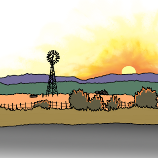 |
| My Starting Image |
Then do the following:-
- Selected a thin blur tool, then using the line drawing constraint, stretch lines across the page from left to right. (ensure all in same direction)
- Add thin grey lines running across the page, but don't be too perfect here.
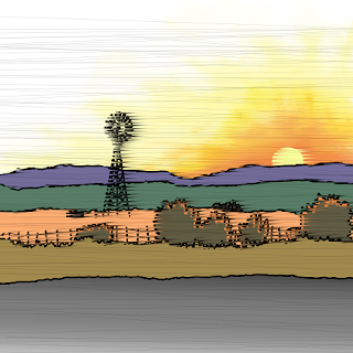 |
| Motion Blue and Whiz Lines Added |
It really captures the sideways smearing caused by movement, with the grey lines borrowing from the whiz-line technique in a subtle way.
Now, when I add a cowboy riding a rodeo bull, it gives the feel of movement and speed.
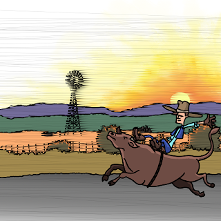 |
| The Completed Image |
The completed cartoon can be found here -->
http://area5-1.thecomicseries.com/comics/81/


No comments :
Post a Comment