Friday 24 July 2020

Cartooning - Looking For Improvement

Sometimes you can come up with a good idea, you've drawn it to your best ability, but it just doesn't look right. It might be that there's a problem with the logic, or the scale, or just something that goes against our pre-concieved ideas about how something should work.

Often we don't find out about them until it's too late.

What's Not Right!

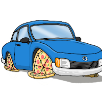
The car on the left is the original drawing which was meant to demonstrate my pointless invention, the pizza wheel. The more I looked at it, the more it just looked wrong, and it doesn't take a genious to realise this italian bread based food couldn't possible hold a car up like that.

The Original Image The Corrected Image
The corrected image not only looks more convincing, but it drives home (excuse the pun) the idea that using a pizza for a wheel is stupid.

Scale Issues

Sometimes you can put images together that bind with some people because they have a very fixed idea in their head of relative size. I have a few examples of this.

Example 1
This image was copied from a picture I found on a google image search and I wanted to replace their giant robot head with that of my comic hero, Bender. Then I threw in a load of other sci-fi elements in amongst the junk, plus an old washing machine (just because).

Bender's Head Problem

Now, the Death Star wasn't a problem, because the mind can reason that it's far away. But a giant Bender's head started to raise questions as to how big my little green men are. To be honest, I hadn't given it much thought, it was just a tribute. It could have easily been fixed by adding "Oversized parts, our speciality" to the sign.

Example 2
The next example was posted on Reddit. I hadn't really given relative sizes much thought, and my ignorance got the better of me. (And boy do those guys let you know when something's wrong!)

Can You Spot It?

 Okay, here's the second from to Starwars - A False Hope. I just needed to make the scene look congested, so I threw in as many vehicles as I could find. (some I'd already drawn in previous cartoons). Can you spot which one is wrong?

Well I drew one of these Juggernaut Carriers from the Clone Wars, but my reference image had no figures for scale, so it's way too small. Easy mistake to make, but the ubber geeks are very defensive about their canon.

That little mistake gained enough down-votes so that the comic was essentially buried!

So What's The Answer

  1. Consider your audience, are they picky?
  2. Know/understand what you are drawing.
  3. If you break the rules, have a reason or explaination.
  4. Review your unfinished work with a friend.
  5. Ask yourself the question "is there anything wrong here?"

Monday 29 June 2020

Fan Art (...and how I got it)

Introduction

As a small-time, tin-pot, have-a-go comic artist, there's nothing better than getting a bit of recognition for the time and effort I've spent producing stuff. We give it away for free, so getting the odd word of encouragement really goes a long way.

I'm very lucky, I've had a few artists recreate my Area 5.1 aliens as fan art.

My first fan art created by Pip Another fan art from Amalock1
A recent feature in McGrenivan's Comic

It's fantastic to get featured like this, and it seems that my opening comic really appealed to people.

How to get Fan Art

Well, exactly how you go about getting fan art is unclear. I can't tell you what to do, but I can go through some of the things that possibly resulted in these artists taking the time to honour me this way.

These are:-
  1. Have characters that are unique and easily recognisable, no matter what drawing style is used.
  2. Be supportive to other artists, especially those who are following their own path.

Be Unique

I do a couple of cartoons, Area 5.1 and Funstreak, and you'll notice that all my fanart come from Area 5.1, and that it's easy to recognise my characters. I use relatively simple shapes and colours that stand out. That green is very unnatural and all pieces of work use that exact same colour along with the red hands and feet.

In short, my Little Green Men were designed to be simple.

My first Character Sketch


Be Supportive

Secondly, you need to get into the community spirit and support new artists. Most don't really know what they're getting into and find that the busy world of a cartoon site means their work quickly moves off the main page and gets lost in the huge amounts of work from established toons. Trying to get noticed is difficult, especially if you don't fit in with the typical popular content. It's so easy to associate lack of comments with the idea that your work isn't very good.

Looking at the artist comment that McGrenivan submitted with his Comicbook Ad parody the sentence that jumped out at me was,..
"Special thank you to a few guys who have inspired me to continue this otherwise fruitless venture"
Now to me, that seems crazy coming from such a talented and humorous cartoonist. If you've not seen his work then please check it out,.. and more importantly add a few comments here and there. That's really all I did,.. I'm just passing on what Paztoid did for me when I first started out, and I remember how it kept me going when I doubted myself.

Share the love!

Saturday 4 January 2020

Choosing Cartoon Frame Dimensions

Introduction

Multiple frame cartoons often require quite a bit of planning and pre-design in order for the frames to successfully fit together. It gives you a traditional comic page style look and they tend to be interesting and varied. Often I have created a mock-up, a bit like a thumbnail as a way of working out the aspect ratio of each frame drawing, and decide how much space is needed for text.

Once I have all of my images drawn up, I can replicate the frames in ComicLife and put it together along with the dialogue. Here's a few that I've created in the past..

Some of my traditional examples

This was great, until you start to look at the modern mobile friendly sites and how our multi-frame images now become a problem.

Welcome To Instagram

Sites like Instagram are designed around the mobile phone, and they are the modern way that people consume. We'd be foolish to ignore this as a place to upload our cartoons, but there's a few things to be aware of:-
  1. Consider that everyone is going to be viewing on a 5 inch screen, so it doesn't make a lot of sense to upload as a single traditional image if you have multiple frames. Images will be too small and any dialogue will be illegible. (So, upload your frame images as a multi-image posting.)
  2. Instagram reformats uploaded images as a square picture, only it's not very smart about it. Any rectangular pictures will be cropped and you will have no control over how it does it. (Time to switch your frame aspect ratio to 1:1 square.)

Dare To Be Square

While I admit a square frame doesn't look as nice, it makes life easier in lots of way. Planning is easier, everything's square, so it's just a matter of deciding how to fit inside a standard layout. Odd number of frames still don't fit together that well, but it's no more a challenge than before. The comic sites are also becoming more mobile friendly, so it makes sense to ensure that you can fit everywhere.

Here's a couple of odd and even frames examples..

Some of my square frame examples

So, if you haven't already switched to square frames, what are you waiting for?

My latest cartoon available here --> http://area5-1.thecomicseries.com/comics/95/